Tuesday, 28 December 2010
Fourth Day of Shooting
Wednesday, 22 December 2010
Ancillary Task- Unique Selling Point
To summarise the unique selling point in a nutshell, it would go along the lines of- A short psychological thriller, executed through a sparse budget, for people with a sparse budget, while still offering intellectually stimulating footage that mirrors our demographic.
Marketing Techniques for our film – Other Films and their target audience
Tuesday, 21 December 2010
Music/Sound
I therefore went ahead and searched for music on freeplaymusic.com. While much of what I sampled would not have been appropriate for our film, I very much liked the following piece:
The inspiration for using this type of non-diegetic soundtrack is the ending for the film 'Saw'
http://www.youtube.com/watch?v=fJyvVMgl-p0
(unfortunately embedding is disabled by request in this video)
The music while the twist is being revealed is appropriate for the genre and heightens the intense atmosphere of the film’s ending. The rapid editing used for the flashbacks is also a technique which could be put to use in our film, as it gives a sense of déjà vu, and is also very effective.
Extra Shooting
Therefore, after lengthy discussion with the group we decided that we would have to film more footage, as it was the only way to achieve the effect we desired. Although the Christmas holidays are upon us, we decided that the extra effort required to find another video camera and assemble the group in our own time is worth it if we are to make our film to a good standard.
Of course, the extra shooting will also require careful planning if we are to make the most of our time and be as efficient as possible, so more on this to come…
Script Changes
Psychiatrist: So let’s progress. Within this world, within the confines of your own existence, explain your troubles. What bothers you?
Patient: Hmm… I dunno’. Every morning, I get up, and I think what am I doing here? What am I feeling? What am I giving?
Psychiatrist: You see (name), it doesn’t matter what path you’ve gone down, or where you plan to go. You just need to find some hope in this world.
Patient: Hopes just a word, and you can’t just find it at work, or with the family, or in some dream. And sometimes you just think, damn, have I really got to live like that?
Psychiatrist: Well now, that’s why I’m here, together we can beat this.
Patient: Are we done?
- - - - - - - - - - - - - - - - - - - - - - - - - - - - - - - - - - - - - -
Patient: Now listen, I may be wrong, but this hope you speak of. It lies in the air we breathe, the sounds we hear, and the water we lay in…
Although this script was a good base, when we heard it being spoken aloud we decided to change some elements as they did not sound completely natural.
Psychiatrist: So let’s progress. Within this world, within the confines of your own existence, explain your troubles. What bothers you?
Patient: Every morning, I get up, and I think what am I doing here? What am I feeling? What am I giving?
Psychiatrist: You see Christian, it doesn’t matter what path you’ve gone down, or where you plan to go. You just need to find some hope in this world.
Patient: Hope is just a word, and you can’t just find it at work, or with the family, or in some dream. And sometimes you just think, damn, have I really got to live like that?
Psychiatrist: Well now, that’s why I’m here, together we can beat this.
Patient: Are we done?
Patient: I’m going to try something new today. I want you to close your eyes, take a deep breath and relax.
The decision to get rid of the “Hmm I dunno” was taken in the editing stage, as I felt that it didn’t fit very well with his character. It sounded a little false and didn’t seem right, but it was easy to omit during editing.
The final line, “Now listen, I may be wrong, but this hope you speak of. It lies in the air we breathe, the sounds we hear, and the water we lay in…” simply did not sound like something somebody would say, so we filmed an alternate line the next day. The new line was inspired somewhat by the opening of the Dream Theater album which I did a post on earlier. It also fitted better with the plot, as he is told to close his eyes and it is implied that this is when the psychiatrist kills him.
Ancillary Task- Analysis of The Psychological/Thriller Posters
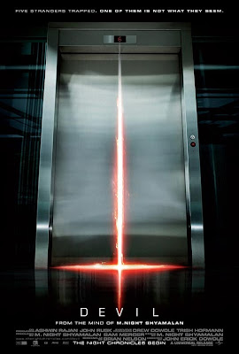 When deliberating as to what posters I should analyse within the confines of the psychological/thriller genre, I decided to delve straight away into M. Night Shyamalan’s 2010 production dubbed “Devil”. Watching the picture in September I can happily reserve judgement on the films quality, while essentially focusing the films chief ideas, and how these notions are reflected through their posters.
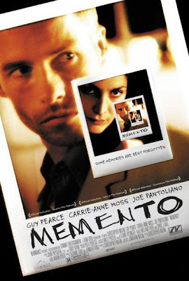
For my second psychological thriller film poster I decided to analyse Christopher Nolan’s narrative warping classic Memento. Written and directed in 2000, the film centres on Leonard Shelby, a man with anterograde amnesia who is unable to render new memories, yet completely driven to lay a path of vengeance towards the man who raped and murdered his wife.
What initially struck me as somewhat interesting was the use of Polaroid photographs to formulate the poster. Once watching the film, the audience are aware that the life that Leonard Shelby once lived has now faded into the past, so to some extent, the pictures should almost strike the audience as a singular frozen moment in time, something Leonard, nor the audience should never forget.
While remembering something such as a photo may not entice the audience, it is also important to analyse the copy-“MEMENTO”. The writing itself is incredibly rugged and almost embedded into the photo quite forcefully. This should accumulate pre-conceived notions in the audiences’ minds of an incredibly frenetic, impulsive anger, and when coupled up with the incredibly tense NVC (non-verbal-communication) that this concentrated moment in time will involve some type of sickening vendetta.
Once again, the poster adopts a snappy dynamic tagline dubbed- “some memories are best forgotten”. This sense of ambiguity should raise questions in the audiences mind concerning these memories, and what the future should hold for these two people within the shots.
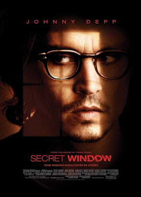
Similar to the two films above, Secret Window is a 2004 psychological thriller film directed by David Koepp.
Similar to Devil, the posters copy is flourished in a very sickening, oozing red. What struck me was how the typeface for “window” is almost smudged and disfigured, which should instantly evoke audience reaction, as something in this poster is evidently blemished, which in some sense anchors the films plotline.
This generic uneasiness and danger is furthermore anchored through Johnny Depp’s NVC. This is reinforced by the fact that the shot is a close-up, which should emphasise some sense of claustrophobia or paranoia. I think it is also incredibly interesting how the window pane almost breaks his face into quarters, which could connote a sense of a dual personality, which is truly reflective of the films narrative plot.
As a whole, I would conclude by stating that this psychological thriller poster has been incredibly ingenious, in the sense that it unfolds a lot about the plots narrative course while simultaneously concealing anything too important. For instance, Depp looks neither volatile nor vulnerable, yet the red danger-connoting slewed copy would simply suggest that he is unstable. The fact he is partially concealed behind a jaded shadow could propose that he is hiding as a victim, or a felon. If this psychological/thriller captures anything in the audiences mind, it would be an overwhelming sense of ambiguity and unease, a suitable catalyst for any passionate thriller fan.
Friday, 17 December 2010
Marketing Techniques for our Film – Creating a Trailer
One excellent example of a trailer is for the film ‘The Shining’ (Dir. Stanley Kubrick, 1980). Though there are a number of trailers for this film, there is one that really stands out. Just one shot is used in the promotion, which is of a set of elevator doors. As the crew credits and the name of the film pass by on screen, blood suddenly gushes out of the elevator and covers most of the room. This trailer appealed to us as we loved the ambiguity of it, the idea that no one knows the plot of the film or even the specific genre, but the image on screen immediately gives shock and creates enigmas that the audience can only answer by going to see the film. Our group agreed that this approach would be better suited for our film – a teaser trailer rather than a full one would keep the plot of our film hidden and hopefully make people question what our film is about.
Another good example of a trailer is for the film ‘Stir Of Echoes’ (Dir. David Koepp, 1999). This trailer is very different to the one mentioned above, as it is longer and contains vast scenes from the film itself. This is not necessarily a bad thing though, as many clips from the film can still be shown without the narrative of plot twists being give away to the audience. All of the group preferred the trailer for ‘The Shining’, but agreed that if our film went into production, several trailers would have to be created anyway. So, after viewing, our group searched through all of our footage and picked out what clips we thought would suit this type of trailer. The clips that we thought would draw the audience were all major plot points in our short film, and we agreed that the footage would have to be heavily edited to keep the plot intact and a mystery.
Another stereotypical piece in trailers is the voice over. Most trailers nowadays tent to veer away from the voiceover and have captions come up on screen instead. But in the past, almost every trailer had a voice over and the voice usually changed upon genre of the film. This led our group to another discussion – whether to include a voiceover or captions. The group agreed that the voiceover was too generic and cheesy, but the captions idea divided the group. Aster much careful thought, we agreed that if a teaser trailer much like the one for ‘The Shining’ was developed, there would be no need for captions as the images shown on screen should wet the audiences appetites until the release date for the film would draw closer.
Upon finally deciding on the type of trailer and how we would go about it, the group started writing down and drawing up plans for trailers and where and when they would be shown. If our film was ever released to a wide audience, we are confident we would know exactly how to market it and draw in our target audience.
Thursday, 16 December 2010
Marketing Techniques for our Film – Viral Marketing
There are many ways of promoting a film. They range from the traditional way of posters around the country in places such as bus stops and train station, to TV adverts and trailers, to marketing the film on the internet using a more interactive approach. After much careful deliberation, our group has decided that because our target audience is typically teenagers and adults that are technologically sound, viral marketing will be the best way to market our film and will most likely result in more people seeing the film and leading to bigger profits.
Once we had decided what marketing technique we would use for our film, the group had to come up with ideas for posters, trailers and interactive graphics. We seemed to struggle at first, but once the first excellent idea became apparent, more began to flow.
The first (and perhaps most important) item that we completed planning was the poster. Every film has a poster (or “one-sheet”) and it is always one of the main reasons that people are drawn to the film and become interested. Usually the first item released in conjunction
Now that our group had our basic poster idea, we set about deciding what viral marketing techniques would work well for our film. We drew inspiration from the film ‘Inception’ (Dir. Christopher Nolan, 2010). Though the viral marketing campaign wasn’t amazingly huge, the main part of the campaign we were interested in was the way the director and crew kept the story so hidden, right up until the release date. Many viewers of the film went in ‘blind’ and did not know the story at all, giving the film a bigger impact and special feeling. We decided that this was exactly what we wante
Another film that used viral marketing well and influenced our campaign was ‘Cloverfield’ (Dir. Matt Reeves, 2008). A trailer for the film was released a year before its of
Overall, our group feels that if our film wanted to gain a wide cinema release a viral marketing campaign would be the best way to promote our film and draw the public interest. People of all ages use the internet nowadays, and it is probably the best way to promote a film, as long as the campaign is interesting and original. Of course, other traditional methods would also be employed but we feel that promotion on the internet sparks more interest from more people.
Tuesday, 14 December 2010
3rd Day of Shooting
Arriving on location just after 10:00 am, the group unpacked and began getting to work. We all agreed that our main task for today was to get the opening sequence finished and ready to upload when we got to back to school. This particular sequence is very important in the context of our film, so we knew getting it right was a must. The scene was going to be shot in the bathroom, which we had decided fitted the storyboard and original ideas nicely. Some problems arose before shooting could begin, however. Main actor David Huxford needed to be in the bath for this scene, but had not brought a change of clothes. James is a very different size to David so he was not able to allow him to borrow and clothes. David decided to go ahead with the scene, even though it would prove inconvenient for him later on. Another problem we had was with a very important piece of iconography – the radio. The radio is important as it leads to the reveal of the twist at the end of our film, so we knew that without it, the whole film was in jeopardy. After searching the house for a radio, or anything that looked remotely like one, two group members decided to go back to school and borrow one (fortunately the school was only a couple of minutes drive away). Upon returning they had found a radio and had also brought along a spare tape for the camera – a decision that would prove vital later on in the day. Of course, it was just our luck that as we were preparing the scene, James found a radio that was perfect for the scene and the whole tone of our film. Finally with the scene prepared, David got into the bath, we placed the radio on the ledge of the bath, and began filming.
The intended shot was a steady cam pan following the wire of the radio from the plug, to the radio itself, passing the patient’s lifeless body along the way. When coming up with this scene, the group knew it would be hard to complete but agreed that if we managed to pull it off it would look fantastic. What we didn’t account for was the way we were going to film it. Because the plug socket was on the floor, no tripod or tracking device would sink that low, meaning that we had to film handheld. Taylor, James and David Waters each had many tries tracking the wire, and some were successful but the group still had a feeling they could have been better. We tried putting the camera on a swivel chair with wheels and moving the chair but the noise of the wheels was too loud and the chair wasn’t as smooth as we would have liked. After changing angles slightly, the group became happier with the shot and believed we could edit it into something special.
Another important shot that needed to be completed was the ‘backwards clock’ shot. While storyboarding, the idea came up about seeing a clock ticking backwards, to give the film an eerie and supernatural tone. Though potentially a simple shot, we took time in preparing it as the clock needed to be straight and in a good area of the room. We also agreed that the camera should be in line with the clock and zoomed in very near. After positioning the camera, the group pressed record and left the camera to its own devices, as much footage had to be recorded to get the full effect of the hands ticking backwards. This gap allowed us to rest and think about what other footage needed to be recorded later.
After allowing the camera to record a significant amount of footage of the clock, we set about planning for the next scene, which was intended to be the scene where the patient can’t get his clothes as smart as we would like and begins to get agitated. Two more problems occurred though, as at first the group couldn’t decide on where to film this particular scene. One argument was that James’ house was basically too nice and wouldn’t be the kind of place where someone with mental problems and inner demons would live. Another argument was that the shots weren’t interesting enough and needed to be edited before we shot. Before those arguments could be resolved however, David Huxford was too wet from the bathroom scene to film anymore in the right clothes. The clothes are obviously important as continuity must be achieved, and with his dampness, filming had to abandoned until another day.
Fortunately, not many shots remain to be filmed and we are nearing completion. The group has agreed to film yet again on Wednesday 15th December, this time with co-star George Austin as well, giving us time to film the dressing scene, a further scene with the two characters and carry out any more shots we may have missed last time or feel need to be re-shot. Hopefully, Wednesday will be our final day of filming and we can then get around to editing the shots into our final product.
Saturday, 11 December 2010
Ancillary Task - Film Posters to Influence Ours
One poster that has influenced us is the poster for ‘American Psycho’ (Dir. Mary Harron, 2000). Though there are various posters for the film, this one shows main character Patrick Bateman’s lust for violence (the knife) along with his need to be seen as successful (the suit). This is similar to our main character – the patient. Though he doesn’t have a desire for violence like Patrick Bateman, h
While the American Psycho poster focuses on the main protagonist, other posters that have influenced us focus on unusual and intriguing images rather than characters and the actors that play them. Since our film obviously has no ‘stars’ in it, focusing on interesting images in our film may interest more of the public. The poster for the film ‘Spider’ (Dir. David Cronenberg, 2002) does have the star Ralph Fiennes on it, but it focuses more on disturbing imagery and dark, relentless colours. This poster is very murky, unveiling the film’s tone and atm
Another poster that has influenced us is for the film ‘American Beauty’ (Dir. Sam Mendes, 1999). Though not the same genre as our short film, the poster relies on just one image, even though the film contains two big movie stars – Kevin Spacey and Annette Bening. The image is very simple yet thought-provoking. The bright colours immediately grab the attention from people and the single image filling the whole poster has an overwhelming effect on the senses. Just from looking at the poster, the audience can tell that this film is something different and unusual to other films coming out of Hollywood. Our group may also create a poster similar in vein. By finding one specific image we could show our target audience that this film is something worth looking into as it is diverse and atypical. We should also make sure we choose the colours for the poster carefully, as colour can have a large affect on whether the public is attracted to the film. For example, since our film is a mystery thriller with a death in it, colours associated with crime and murder would be a good route to go down. Reds, browns and greys will allude the public to the tone of the film and give the poster an overbearing, envious and dirty feel. This would hopefully show people that the film is not a typical Friday night popcorn movie, but one that the audience has to engage in and think about.
Thursday, 9 December 2010
Ancillary Task: How We Can Improve
Awards are a good thing to advertise on a poster as audiences like to see a film with prestige. Many independent film posters are solely advertised on awards alone, as not many people may know either the actors or directors that were in the production of a film. An example of this would be from the film poster for ‘Looking for Eric (2009, Dir. Ken Loach). Because not many people would have known who Ken Loach and the actors were (other than Manchester United fans knowing Eric Cantona). Because of this, they advertised the 4-5 star reviews they got on the poster.
As well as this, the text at the bottom of posters (usually to show the credits of the film) would gain us marks, because it makes it official. However, making one personalised for our group would take up a lot of time, and considering time is running out rather quickly. We could possibly rob some text of another film poster saving us time, but then we would have to search for an appropriate one, which would again cost us time. However, the main focus of our group is to included the text at the bottom and reviews to entise audience members to seeing our film.

The items mentioned that need including in the final design for our poster to make it more official in terms of apperence, and to entise audience into paying money to see a film (more specifically our film). These wouldn't necessarily effect the design of the poster (such as the main image and text) but positioning is key to preventing it getting in the way of the main image and/or title of our film.
Ancilliry Task: Film Poster - First Draft
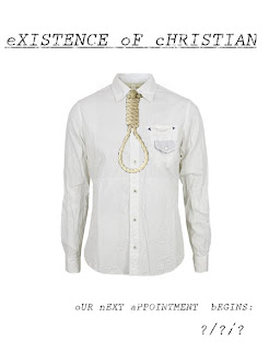

 To begin with, the title of our film came after a long and thoughtful discussion with members ofthe group and others that we know. We got the existence part of the film as our film shows thefinal moments of our character, who is eventuallymurdered by the psychiatristin our film, but it is made out to look like suicide throughout the film. Then we want a very average name to contemplate the mood that we wished to create in our film, to which we decided on the name ‘Christian’. Coincidentally, one of the people that gave us the idea for this was a friend of our named ‘Christian’. The slight faded effect of the writing was inspired from the card that we used in the AS film opening ‘Allegiance’,as well as the fact that it represents the slowly declining mind of the main character
.


Hopefully, some of the ideas used in this poster will be incorporated into the final poster used to present our film to audiences. Otherwise, if we do decide this poster to use, the group can add things to the poster to make it more appealing to audiences. This I hope will give us a better chance of gaining a better grade in the ancilliry tasks.
Wednesday, 8 December 2010
Influences - Shaving Scene
Development of ideas
We decided that instead of the ending twist being that the psychiatrist is killed by the patient, the patient should be killed by the psychiatrist. We thought that the twist should be that the audience is led to believe that the patient has committed suicide at the start, and at the end we find out that they are actually killed by the psychiatrist, who drags the body to the bath tub we see the patient in at the start and places a suicide note by his body.
Not only will this be a more effective twist, it will allow us to implement several ideas:
- There will be a news report on the radio about killings in the area at the beginning, planting enigmas in the mind of the viewer.
- Our chosen setting of a fairly plain and conventional house will provide the perfect setting, as the psychiatrist will be calling into the patient’s house. This will allow us to make the ending effective as it will only look like a suicide if the patient is dead in his own bath tub.
- As we see a hand writing a suicide note earlier in the film, the audience will not know who the hand belongs to, again creating enigmas.
The final scene, although originally planned to be a repeat of the first scene, could be extended so that the radio says that the serial killer is posing as a psychiatrist and making the murders look like suicides.
Day 2 of shooting
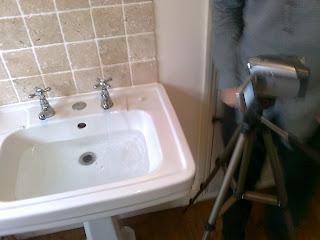
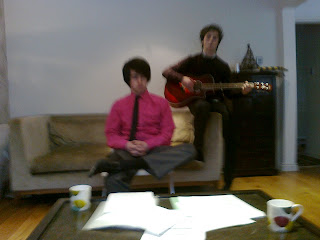
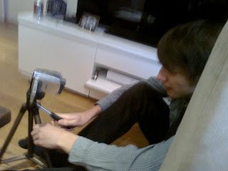

On Wednesday the 8th December, with the school back open and the snow mainly cleared on most roads, we decided to take this opportunity to shoot some of the key scenes of our film. Unfortunately, there were yet more problems to come. Taylor was unable to make it due to having important lessons which he could not miss, however as the rest of the group and our actor all had free periods, and with time running out we decided that the only thing to do was to film without him.
We set off for our location (James’ house) in the hope that it would provide adequate mise-en-scene for our film. Initially, our first thought was that it would be a somewhat unimaginative setting for a film which is intended to be interesting and thought provoking, so we considered revising our setting to avoid making our film look like a run-of-the-mill sixth form film. However, we decided to do as much filming as possible while we could and see how it turned out, with the possibility of re-filming our shots in another location if the result was not satisfactory.
As it turned out, with some furniture rearrangements and strategic framing of shots, the footage we acquired turned out to look much better than expected on camera.
During the course of the day we managed to film three important scenes, including the scene where our protagonist is shaving in the mirror; the conversation between the psychiatrist and the protagonist; and the scene in which the protagonist is getting dressed.
Of the shots we attained, the one I was most proud of was of the protagonist shaving in the mirror. We achieved the effect of blood dripping into the sink with red food colouring, which proved to be the perfect texture and colour to look like blood. The positioning of the camera so that the framing was correct and the pan up to the mirror (making sure also that there were no unwanted reflections) took a long time to perfect but in the end it was worth it.
We also improvised with the camera, using camera angles and mise-en-scene not necessarily shown in the story board to create interesting shots. For example, we shot the getting dressed scene at a tilt in order to subconsciously convey a sense of something not being right to the audience. This technique has been used successfully in great films such as Twelve Monkeys (1995, Terry Gilliam); in which almost the entire film is shot at a tilt, giving viewers the distinct feeling of impending doom.
Overall, our day was rather successful, and we were even inspired to develop our ideas further, changing the storyline somewhat in the process (more on this in another post).
Friday, 3 December 2010
The Post Production Process
The editing software we will be using will be Pinnacle Studio 14. Although there are other editing software packages on the market; some of which are free to use, and some of which may be more advanced; we settled on Pinnacle as it is familiar to all of the members of our group from using it for our AS level productions. It is a high-quality software package, which is simple to use and will allow us to concentrate on making our production look professional without having to worry about re-learning anything. I also have the software available to use at home which is convenient for the group if any editing needs to be done which cannot be done during school time.
It is important that in the post-production process we learn from last year's project. One thing that I found extremely helpful when editing last year was having a well-thought out and clear storyboard on hand allowing me to put each shot in the correct order relatively easily.
It is of paramount importance that we get many different takes of each shot to make sure that we do not have to go back and re-film anything, as this can often lead to issues with continuity, as outside shots can easily be shot at different times of day or in slightly different weather conditions. We also need to make sure that we get all of our filming completed as soon as possible to allow for any problems during post-production.
It would also be helpful to have a second person on hand to give a second opinion on which shots to use and when to cut a scene, as this can often lead to better results.
Wednesday, 1 December 2010
2nd Day Shooting Dilemma

With this arrangement set firmly in the groups minds we set off to prepare for the days shooting. With Dave devising some last minute script notions we even began to reconsider re-drafting the script for the day ahead. However, a day prior to the shooting process the BBC Weather Forecast looked somewhat daunting. Reports had been formulated stating Heavy snow and light rain showers for the night.
If the forecast was accurate to any extent, the days planning would have to be abolished. This fundamentally derived down to a series of reasons, the most predominant being the fact that if the snow was as relentless as predicted, the team wouldn’t be able to congregate at all. Secondly, the shots captured in the sequence prior were merely somewhat foggy; therefore the conflicting mise-en-scene would be extremely noticeable.
As a result, we have been left with no other choice but to shoot another day when the snow has cleared- perhaps the Friday of the week. However, one lesson to take from this unfortunate circumstance is that we need to scheme these days more thoroughly, insuring the weather will match the cinematic frameworks, and preferably earlier in the year, with more time to spare.
Choosing Our Actors
For the character of the patient, our group searched extensively for the right actor. We had described and imagined the patient as a skinny man of average hei
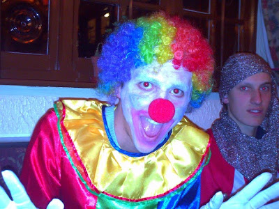 ght, who looks stereotypically ‘normal’ – trying to fit in. He wears shirts and ties most of the time, attempting to look smart. His main goal in life at this time is to desperately try to hide his inner demons, so he often has a stressful feel about him. Many people from our school were considered, but nothing seemed to quite fit or some were unavailable. The shooting requires quite a lot of effort and time, meaning that people’s lives were going to be interrupted for a brief time, and with mounting school work people had to decline. After much deliberation, we decided that David Huxford, one of our group members would fit the part. Though he is quite tall and perhaps not exactly the look of the patient we were looking for, he seemed enthusiastic and enthralled to be placed under the spotlight. It turned out to be quite convenient on our first few days of shooting, as David knew the story
 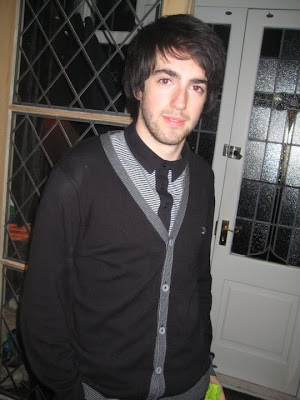 inside out and understood what emotions and mannerisms were required. As a group we are now happy with our decision and hope that audiences to our film will connect with David’s portrayal of the character.
Finding the actor to play the psychiatrist proved to be much easier. Almost as soon as our film had its basic plot and we knew a psychiatrist was going to be involved, we all had someone in mind. Our friend George Austin is very elegant and we feel has the perfect look of a psychiatrist. First of all his beard adds sophistication to the role and gives the character a father-like quality that our group thinks can be hard to find. George also owns a very stylish coat that we may incorporate into our film as it has a look of success and will hopefully give viewers an idea of experience. George also has a very masculine yet sensitive voice, which we hope he can use to his advantage in the role – being what the patient inspires to be yet also being caring and considerably ‘normal’.
Overall we as a group feel confident in our actors and hope they can have the impact we intended the characters to have from day one.
Tuesday, 30 November 2010
Setting and Location Ideas: Psychiatrist Office
Keeping that in mind, we all set out searching yet to no avail. It seemed that no matter where we looked it because almost unattainable to locate a room that would enhance all the ideas and notions we were trying to arise during our short thriller.
This could reinforce the suggestion that these are just normal people, with completely juxtaposed views upon how they live their lives. It would also anchor the violent, more climatic scenes towards the films conclusion, as it would ground the film and make the scenes unfolding before the audience seem more authentic.
Some of the problems we may encounter however derive back down to the fact that the room is a living room- not a psychiatrist office. However, like all good directors of their art, we can hopefully mould this around the plotline. For example, protagonist Christian is a volatile yet intellectually stimulated being, who has almost lost faith in the world and the people around him. So when he is forcefully subjected to see a phoney psychiatrist, trying to conform to a world gone wrong by preaching from the confines of his own phoney living room, this would infuriate the protagonist, ultimately leading to the psychiatrist’s demise.
Obviously, we could manipulate the space we have, to reflect the psychological/thriller genre. Such examples would include removing the rugs, sofa and family pictures. We could even pull the blinds and dim the lights to formulate an almost surreal, dreamlike sequence. One group member even suggested lighting the fire, which co-links with such films as “Shutter Island” in the warden office. As the room is quite drawn out as well, I can picture that reinforced long shots of the two over the table would anchor the scene quite fittingly.
Like with all initial ideas, I can understand that on the very day of shooting this room may not meet the required standards that our group are longing for. For example the lighting may be wrong, the required camera angles may be inaccessible, the mise-en-scene may conflict with opposing scenes etc. However, hopefully this suggestion will speed up the shooting process and enhance our marks in the long run, balancing on the factor of luck and how the footage looks on camera.


Monday, 29 November 2010
The "Scenes From a Memory" Influence
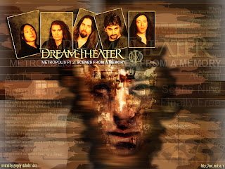
The concept album "Metropolis Pt.II: Scenes From a Memory" by progressive metal band Dream Theater is an album which has influenced some of the ideas for our short film.
The album centres around the story of a man called Nicholas, who has recurring dreams of another life. He goes to see a psychiatrist, and the album opens with words softly spoken by the psychiatrist:
"Close your eyes and begin to relax. Take a deep breath, and let
it out slowly. Concentrate on your breathing. With each breath
you become more relaxed. Imagine a brilliant white light above
you, focusing on this light as it flows through your body. Allow
yourself to drift off as you fall deeper and deeper into a more
relaxed state of mind. Now as I count backward from ten to one,
you will feel more peaceful, and calm. Ten. Nine. Eight. Seven.
Six. You will enter a safe place where nothing can harm you.
Five. Four. Three. Two. If at any time you need to come back, all
you must do is open your eyes. One."
The album takes the listener on a journey through which Nicholas discovers that the dreams he has been having are of a girl called Victoria who lived 70 years earlier. The regression therapy focuses his dreams so that they are much more vivid, and he is able to meet Victoria. She reveals to him that there is a reason that she is haunting his dreams, and tells him that she wants him to know her story and has been searching for a way to reveal the truth about her death.
Eventually, Nicholas learns that the reason he is being haunted is that he was Victoria in a previous life, and therefore they share a soul. After discovering this, finding out what happened to him in a previous life becomes an obsession, and he feels that he cannot rest until he uncovers the truth. It takes over his life.
As the album unfolds the listener learns that Victoria is in love with Julian Baynes, but that she is drawn into an affair with his brother Edward because of Julian’s lifestyle of gambling and drinking. Newspapers report that Victoria was shot by Julian, who then killed himself, leaving a suicide note. However, Nicholas believes that this is not the truth.
At the end of the song “Fatal Tragedy”, the psychologist says "Now it is time to see how you died. Remember that death is not the end, but only a transition." This is a reference to the fact that Victoria was reincarnated as Nicholas:
This is significant as we learn that not only was Victoria reborn as Nicholas, but that he carries the same personality traits as Victoria, and also that deeds will follow his soul through eternity. This foreshadows the fact that eventually the story will come full circle and that the same thing will happen to Nicholas.
Eventually, Victoria ends her relationship with Edward, leading Edward to kill his brother and Victoria. He then writes a suicide note and puts it in Julian’s pocket, getting away with the murder.
Satisfied that he has uncovered the mystery and that he can go back to his own life, Nicholas goes home and relaxes. However, he is startled when the psychiatrist turns up. He says “open your eyes Nicholas” and then it is implied that he kills him, completing the circle once again. Presumably, the cycle will continue with whoever Nicholas is reincarnated as.
Part 1:
Part 2 (Watch from 3:18)
It can be interpreted from this that the purpose of Victoria haunting Nicholas is to warn him of the vicious circle, however it does not end it as Nicholas is murdered in the end.
It is the cyclical aspect of the story which interests me most, as it deals with the concept that our fate is already decided though we don’t know it. The psychiatrist is also an interesting character because as far as we know he has no motivation for killing Nicholas other than to complete the cycle. The line “open your eyes” is also repeated from earlier on in the album when Edward kills Victoria.
There are many aspects of this story which we will use as inspiration for our film, particularly the words of the psychiatrist as they have an eerie calmness to them which adds to the sinister nature of the story.
Tuesday, 23 November 2010
1st day Of Filming
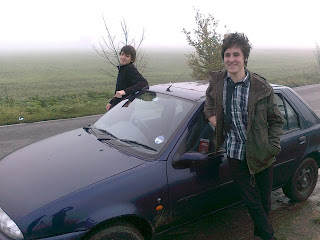 After the awful attempt to begin filming, we as agroup got our act together and decided that onFriday 19th November; we would spend the day filming for our short film. However, because we all had the same lesson first period, we all waiteduntil ten o’ clock to being shooting. So after confirming it was OK to go out shooting for the day, then signing out, we got into Dave Waters car and set off for our first day shooting.
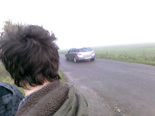
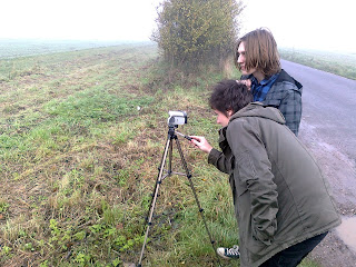 As we began driving to location, we decided what our primary and secondary objectives were to be for the day. Our primary objectives were to film shots of the country side for our opening title sequence. Our secondary objectives were to film parts of the film in which we could edit into the film. The main area of shooting would be in the Billericay country side roads (facing the fields) to represent the every slowly regressing psyche of the main character. The effectiveness of the shots use whilst we were in motion creates the effect of a journey within the mind of the main character.
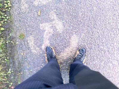
The most difficult part to shoot was the running in the mad scene. Due to the presence of the fog, it created a really nice effect of me disappearing into the distance. However, due to the wet morning conditions, the soil in which i had to run on was shift and difficult to run on. But after checking the footage out, it turned out to be worth the collateral damage, even though mud got everywhere.
The strengths of our first day made the footage look more towards the genre of which we wanted to create. The fact that we chose to film whilst the atmosphere was foggy gave an ominous feel to the video, as well create an amazing illusion when the main character runs into the distance. As well as this, the amount of footage we caught exceeded the amount which we may actually need for the scene we plan to create. Because of this, we have a large variety of choice when it comes to what can go in and out of the title sequence.
The weaknesses of this day, however, did make the day a little less productive as it could have been. For example, we did spend a lot of time driving around looking for locations because we hadn’t pre-planned the set location we planned to use. Also, half way through the day, we began to lack motivation for the task at hand, so we went to Dave Waters’ house in Billericay and began to distract ourselves by filming pointless footage and watching it back on the camera whilst. This not only wasted what little time we had that day to film, but it also crippled us in the sense that we could have used the time more productively (such as organise what we would do on another day of filming).
Overall, our first day of filming turned out differently than i personally had expected it to be. The shots we got were genuinely better than I had expected, but I feel a lot more could have been done to improve our future plans for this project. However, the next day shall further improve the project and get the grade we deserve as a group.


