Showing posts with label Taylor Gladwin. Show all posts

Saturday, 8 January 2011

Evaluation Question 1 - In what ways does your media product use, develop or challenge forms and conventions of real media products?

Title Of Film: Our group thought long and hard about the title of our film, and we agreed we wanted to steer clear of conventional and unoriginal titles. During the previous year of media studies, almost every group’s thriller had a typical one word title that was bland and cliché. The group last year tried to incorporate a long-winded title but nothing seemed to stick, so they went with a one-word title also. This year, our film was much more developed and thought-out. We agreed that an interesting title would be needed to catch people’s eye because of the unusual nature of our plot. I researched other films with longer, interesting titles and found that members of the group that hadn’t seen them were more interested in them than ones with simple, one word names. We all felt that films like ‘The Butterfly Effect’ (Dir. Eric Bress & J. Mackye Gruber, 2004), ‘Eternal Sunshine Of The Spotless Mind’ (Dir. Michel Gondry, 2004) and ‘Catch Me If You Can’ (Dir. Steven Spielberg, 2002) caught our attention much more than uninspired titles. After careful deliberation we settled on ‘Existence Of Christian’. Not only does the title create enigmas throughout audience members, it can also be seen to have a double meaning. Not only is Christian the name of the protagonist, it is also the name of a major religion. Our film has many hidden unanswered questions woven beneath the surface and the protagonist questions his existence and the meaning of life very much. The title could therefore also allude to the existence of God and whether people are right to believe in Christianity. The fact that we had spent much time naming our film showed the commitment our group had to the cause as we didn’t want to settle on a boring name like most other groups have. We feel that if all the short films from our media class were advertised to the public, ours would be seen by the most people as the title and the general story are far more interesting than all the other stereotypical products that have been produced.

Setting/Location: For our short film this year we had more locations than we did for our opening to a thriller last year. While only one location was needed for shooting before, this year our film was slightly more complex and required different locations to explain the story and set up for the finale. The main set for filming was group member James Moss’ house. This was used more than we expected at first, because as filming went on the group discovered that James had many places in his house that were very suitable for the mood of our film. The room in the house we were the happiest about was the bathroom, as it turned out it had all the features we had envisioned this important scene would contain. The scene was the opening and closing scene where the audience first sees a body in the bath, and at the end discovers why it has happened. The room was just the right size and was the correct colour to keep the film fresh. A scene containing a bathroom does not particularly challenge forms and conventions of real media products, as many films have used them – mainly horror/thriller films. The most famous of these is the famous shower scene in ‘Psycho’ (Dir. Alfred Hitchcock, 1960). Though not a particularly original setting, we feel that the way we have executed this scene does develop forms and conventions of real media products as no one in the group could recall any film with a similar premise or camera shots to the ones we have used. We feel that the bathroom scene is probably the most important scene in our film and is our controlling idea and the main thing that people remember about the film.

Costumes and Props: Unlike last year in media where the choice of costume took a lot of time, this year the clothing was chosen quite early on by the group and we all agreed on smart suits with ties. The props on the other hand were a different matter. As the group went through many drafts at the start of the process, props came and went and no one could decide on something good that would stick. During filming however, the ending of our film was altered slightly and the need for a fake suicide note seemed like an interesting idea. After filming the scene, we were happy with how it turned out, but there was a lingering dread in the back of our minds that the use of a suicide note was too cliché and unoriginal. I personally feel that the use of a suicide note uses forms and conventions of many real media products, and perhaps something more original would have sufficed. After much of our film was so fresh and dissimilar over other products, the use of the suicide note felt slightly stale.

Camerawork and Editing: We were very happy with most of the shots in our short film, as we had planned them carefully and many ended up just as we had envisioned them in pre-production. One shot we were excited about was the steady cam pan from the plug socket to the bath in the bathroom scene. We believed that this shot would definitely challenge forms and conventions of real media products. Sadly, when it came to the actual filming of the shot it turned out to be much harder than we first thought. This meant that the shot wasn’t as smooth or flowing as we would have liked and slightly took the tension away from the scene. The shot may not have paid off as well as we hoped, but it is still very original and will hopefully inspire others.

Title Font & Style: The credits for our film was one of the final things we thought up for our product. This wasn’t because we didn’t feel they were particularly important, but because we found it hard to find a font that suited our films tone and style. After our poster had been completed however, the font and use of lower case letters at the start of the words followed by upper case letters caught our eye and we decided that this would be a good technique to use in the credits of our film. Not only does it catch people’s eye, it also keeps the same typeface throughout the marketing strategy showing that we can keep consistency throughout. We feel that though this isn’t a brand new idea, not many films use it nowadays and it can still make the film look different and complex, so it develops forms and conventions of real media products.

Story & how the opening sets it up: After the bathroom scene, the story of our film is set up by the conversation between the patient and the psychiatrist. This scene shows the complexities of their relationship and how the fragments of the patients’ mind are slowly being dissected by the psychiatrist – leading up to the events at the end. This scene took a lot of planning as a script had to be written and the actors had to learn their lines. We also wanted to make sure that this scene showed the tension between the two characters and how under their thick skin they both feel a piece of themselves missing. We felt that the scene turned out pretty well and we were pleasantly surprised by the two actors performances. Thanks to the setting of the scene we feel that this is another scene that our film will be remembered for. Though a conversation between two people in a pretty normal room is nothing special and has been done many times before, we feel ours is fresh and keeps the viewer’s interest throughout, meaning that it develops forms and conventions of real media products.

Genre & how the opening suggests it: The genre of our film is a mixture of a mystery/ psychological thriller. Our film and ideas in general went through many incarnations genre-wise, but we felt that a thriller was something we were all very familiar with and felt we could tell the best story within the confines of that genre. The group thought that the best way to guide the audience into the tone of our film was to immediately show the body in the bath. We agreed that this would immediately show the audience the kind of events that will follow and prepare them. Another way we thought we could go was that we could have begun with a totally different tone to the film itself and put people on edge and off guard. Either opening would have been substantial but neither challenges forms and conventions of real media products because they have been done so many times before. But we do feel that our opening is interesting and will immediately grab audience’s attention, so our opening most likely develops forms and conventions of real media products.

How characters are introduced: Excluding the figure in the bath, both characters are introduced during the conversation in the psychiatrist’s office. We as a group agreed to introduce them at the same time to show the audience that they’re both on the same level, neither person is above the other and that they are both in the same state of mind. We did many posts about the back stories of the characters and the way they are bottling up emotions deep inside them. The way the characters are introduced does not particularly challenge or develop forms and conventions of real media products, but we feel the back story and psychological insight into each character does develop forms and conventions of real media products.

Wednesday, 22 December 2010

Marketing Techniques for our film – Other Films and their target audience

Through more research into marketing our film and finding the target audience, our group realised that we had not planned marketing techniques for after the films potential cinema release, for example DVD promotions and television showings on such channels as Film4 and Shorts TV. We then decided to research these other methods of marketing.
After checking popular websites like Amazon and Play.com, as well as researching TV advertisements we agreed that our film needed to be connected to other films of a similar genre, to draw people in who may have missed the film’s original release or just not been interested or persuaded by the marketing techniques.
After looking on sites that are popular for DVD buyers, I discovered that when looking on any film, there are always recommendations for other films of a similar genre. I personally know that this can be very helpful as it introduces people to other films that they may not have been interested in before. I felt this was important to our films potential success, and the group agreed that we needed to look at similar films to ours and try and draw in viewers of those films to ours.
One film we felt was a good place to start was ‘Moon’ (Dir. Duncan Jones, 2009). The film itself focuses on the main character Sam, who has committed to a job on the Moon for Lunar Industries for 3 years. Everyone in the group has seen this film, and we agreed that it had similar themes and tones to ours. The fear of isolation, only one companion to confide in and the feeling that things aren’t as they seem. The audience for this film was quite varied, as older sci-fi fans and newcomers went to see it, and the film has also been very popular on DVD. The group thought that a ‘for fans of’ section on posters and websites for our film would be very useful and ‘Moon’ will definitely be there.
Another film the group thought was similar to ours was ‘Blue Velvet’ (Dir. David Lynch, 1986). After a fairly ordinary opening, the film delves deep into the hidden realms of this ‘normal’ town and reveals a dark underbelly of lies and deceit. We as a group felt that the general feel of this film captured ours perfectly, and that the slow revealing of the monsters inside the characters was something we were looking to demonstrate in our film. David Lynch has a very large cult following, and we feel that this is something our film may generate as well, because of its differences to the norm.
After more research, our group found another film that we thought we could use to help propel ours. The film was ‘Blow Up’ (Dir. Michelangelo Antonioni, 1966). This film is very eerie and uses minimal amounts of non-diegetic sound, creating a real sense of dread and misguidance. The director also uses a vast amount of different camera shots, with many shots lingering for minutes on end. Another trait the group found intriguing was how no character is ever referred to by name, making everyone seem fragile and guilty. Being an older film, we thought that by relating our film to this one we may be able to tap in to an older and more intellectual audience, rather than today’s mediocre film goers.
The final film our group has agreed to relate our film to is another cult classic, ‘Donnie Darko’ (Dir. Richard Kelly, 2001). This film again centres on a main character that feels alone and, like our main protagonist the patient, is in therapy. Though the film is more surreal and psychological than ours, it possesses a similar darkness and takes the viewer on a comparable journey. A favourite to many in our group, we feel that this is another film that could help us gain more fans.
After much researching, we believe that these similar films will help ours stand the test of time and keep gradually gaining more fans long after the original release. Many of these films have survived not because of successful cinema runs, but because of DVD sales and growing numbers of fans.

Friday, 17 December 2010

Marketing Techniques for our Film – Creating a Trailer

With the basic viral marketing strategy figured out, the group will now turn our attention to the making of the potential promotional trailer for our film. With all the footage finally filmed, and editing currently coming to an end, we are able to look through the clips we have gathered and decide what ones should be shown in the trailer to draw in the public. Before we rush into production however, we must first research other popular and successful film trailers to see how they operate and what makes them interesting to the public.

One excellent example of a trailer is for the film ‘The Shining’ (Dir. Stanley Kubrick, 1980). Though there are a number of trailers for this film, there is one that really stands out. Just one shot is used in the promotion, which is of a set of elevator doors. As the crew credits and the name of the film pass by on screen, blood suddenly gushes out of the elevator and covers most of the room. This trailer appealed to us as we loved the ambiguity of it, the idea that no one knows the plot of the film or even the specific genre, but the image on screen immediately gives shock and creates enigmas that the audience can only answer by going to see the film. Our group agreed that this approach would be better suited for our film – a teaser trailer rather than a full one would keep the plot of our film hidden and hopefully make people question what our film is about.


Another good example of a trailer is for the film ‘Stir Of Echoes’ (Dir. David Koepp, 1999). This trailer is very different to the one mentioned above, as it is longer and contains vast scenes from the film itself. This is not necessarily a bad thing though, as many clips from the film can still be shown without the narrative of plot twists being give away to the audience. All of the group preferred the trailer for ‘The Shining’, but agreed that if our film went into production, several trailers would have to be created anyway. So, after viewing, our group searched through all of our footage and picked out what clips we thought would suit this type of trailer. The clips that we thought would draw the audience were all major plot points in our short film, and we agreed that the footage would have to be heavily edited to keep the plot intact and a mystery.


Another stereotypical piece in trailers is the voice over. Most trailers nowadays tent to veer away from the voiceover and have captions come up on screen instead. But in the past, almost every trailer had a voice over and the voice usually changed upon genre of the film. This led our group to another discussion – whether to include a voiceover or captions. The group agreed that the voiceover was too generic and cheesy, but the captions idea divided the group. Aster much careful thought, we agreed that if a teaser trailer much like the one for ‘The Shining’ was developed, there would be no need for captions as the images shown on screen should wet the audiences appetites until the release date for the film would draw closer.

Upon finally deciding on the type of trailer and how we would go about it, the group started writing down and drawing up plans for trailers and where and when they would be shown. If our film was ever released to a wide audience, we are confident we would know exactly how to market it and draw in our target audience.

Thursday, 16 December 2010

Marketing Techniques for our Film – Viral Marketing

As our film nears completion, we must decide how to market our film to the target audience we have chosen. Our target audience is mostly men between the ages of 15 and 35. Our film is dark and gritty and will most likely not appeal to many women or pre-teen children. The most likely BBFC rating for our film will be a 15, so anyone younger would not be able to view it anyway. Before deciding on our marketing campaign, we must first research how our target audience lives and where would be the best place to promote our film.

There are many ways of promoting a film. They range from the traditional way of posters around the country in places such as bus stops and train station, to TV adverts and trailers, to marketing the film on the internet using a more interactive approach. After much careful deliberation, our group has decided that because our target audience is typically teenagers and adults that are technologically sound, viral marketing will be the best way to market our film and will most likely result in more people seeing the film and leading to bigger profits.

Once we had decided what marketing technique we would use for our film, the group had to come up with ideas for posters, trailers and interactive graphics. We seemed to struggle at first, but once the first excellent idea became apparent, more began to flow.

The first (and perhaps most important) item that we completed planning was the poster. Every film has a poster (or “one-sheet”) and it is always one of the main reasons that people are drawn to the film and become interested. Usually the first item released in conjunction with the upcoming film, the poster gives the public their first view of the tone and themes of the film. An excellent poster with intriguing and original ideas can really draw the public eye and get people pondering about what they are looking at and make them want to go and see the film. Our main idea for the poster came from two group members Taylor Gladwin and David Huxford. David came up with the idea of focusing on the shirt and tie worn by the patient in our short film, as his quest for smartness and acceptance is a major theme of the film. We as a group thought this was a good place to start as it was simple and more ideas could develop from it. As a group we agreed that just the name of the film and a shot of a shirt and tie would be too bland and would not catch anyone’s eye. After more discussions, Taylor Gladwin proposed replacing the tie on the shirt with a noose instead. The group agreed that this made the poster more original and fresh. The noose around the shirt gives our potential audience a feel of the film and shows them that it will be dark and will most likely contain death of some kind.

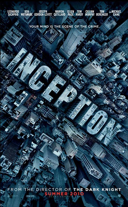
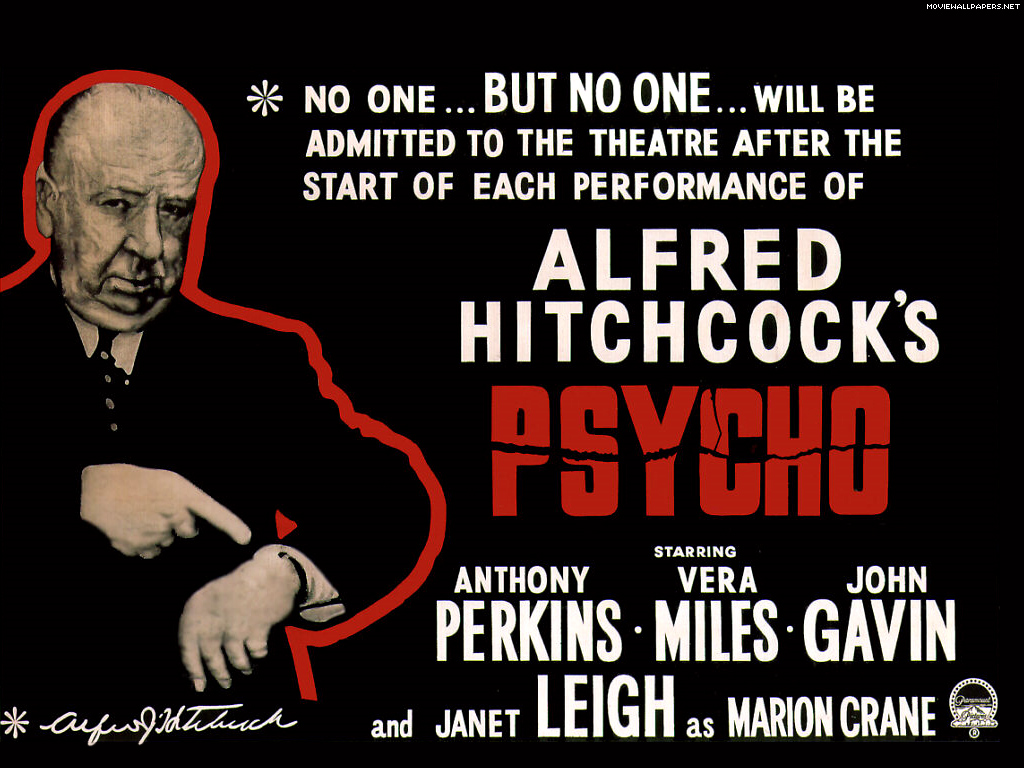
Now that our group had our basic poster idea, we set about deciding what viral marketing techniques would work well for our film. We drew inspiration from the film ‘Inception’ (Dir. Christopher Nolan, 2010). Though the viral marketing campaign wasn’t amazingly huge, the main part of the campaign we were interested in was the way the director and crew kept the story so hidden, right up until the release date. Many viewers of the film went in ‘blind’ and did not know the story at all, giving the film a bigger impact and special feeling. We decided that this was exactly what we wanted for our short film – to keep the plot a secret and just draw people in through posters and viral ads. We also thought it would be an excellent idea to follow Alfred Hitchcock’s rule for his film ‘Psycho’ – who did not allow people to enter the movie theatre after the film had begun. As a group, we felt that this was an excellent idea and would have kept the suspense cranked up. The audience would not have been distracted by latecomers and could be completely absorbed in the film. We agreed that should our film ever get a wide release, this would be another technique we would use, thus keeping the audience delved deep in the mystery of the narrative.

Another film that used viral marketing well and influenced our campaign was ‘Cloverfield’ (Dir. Matt Reeves, 2008). A trailer for the film was released a year before its official release, containing just a website that people could log onto to find out more about the film that at the time had not released a title. As the release date drew closer, to promote the ‘lost footage’ scheme of the film, Facebook pages were created for each of the main characters and were updated regularly. Websites for the fake companies seen in the film we also created, to give the audience the feeling that the events in the film were in fact real. A whole Cloverfield universe was created, to give the film more depth and allow people to be more immersed in it. The campaign proved to be a success, as Cloverfield did very well at the box office. We decided that a similar campaign would work for our film as well. Many teaser trailers leading people to specific websites and ‘treasure-trails’ would get people absorbed in the film, leading them to tell their friends and hopefully make the anticipation for the film larger.

Overall, our group feels that if our film wanted to gain a wide cinema release a viral marketing campaign would be the best way to promote our film and draw the public interest. People of all ages use the internet nowadays, and it is probably the best way to promote a film, as long as the campaign is interesting and original. Of course, other traditional methods would also be employed but we feel that promotion on the internet sparks more interest from more people.

Tuesday, 14 December 2010

3rd Day of Shooting

On Monday 13th December, our group continued filming for our short film. The location was again group member James Moss’ house. One problem had arisen a few days before, as co-star George Austin told the group he would not be available for shooting on that day. Though this was disappointing, the group proceeded, intending to collect specific shots only involving the patient.

Arriving on location just after 10:00 am, the group unpacked and began getting to work. We all agreed that our main task for today was to get the opening sequence finished and ready to upload when we got to back to school. This particular sequence is very important in the context of our film, so we knew getting it right was a must. The scene was going to be shot in the bathroom, which we had decided fitted the storyboard and original ideas nicely. Some problems arose before shooting could begin, however. Main actor David Huxford needed to be in the bath for this scene, but had not brought a change of clothes. James is a very different size to David so he was not able to allow him to borrow and clothes. David decided to go ahead with the scene, even though it would prove inconvenient for him later on. Another problem we had was with a very important piece of iconography – the radio. The radio is important as it leads to the reveal of the twist at the end of our film, so we knew that without it, the whole film was in jeopardy. After searching the house for a radio, or anything that looked remotely like one, two group members decided to go back to school and borrow one (fortunately the school was only a couple of minutes drive away). Upon returning they had found a radio and had also brought along a spare tape for the camera – a decision that would prove vital later on in the day. Of course, it was just our luck that as we were preparing the scene, James found a radio that was perfect for the scene and the whole tone of our film. Finally with the scene prepared, David got into the bath, we placed the radio on the ledge of the bath, and began filming.

The intended shot was a steady cam pan following the wire of the radio from the plug, to the radio itself, passing the patient’s lifeless body along the way. When coming up with this scene, the group knew it would be hard to complete but agreed that if we managed to pull it off it would look fantastic. What we didn’t account for was the way we were going to film it. Because the plug socket was on the floor, no tripod or tracking device would sink that low, meaning that we had to film handheld. Taylor, James and David Waters each had many tries tracking the wire, and some were successful but the group still had a feeling they could have been better. We tried putting the camera on a swivel chair with wheels and moving the chair but the noise of the wheels was too loud and the chair wasn’t as smooth as we would have liked. After changing angles slightly, the group became happier with the shot and believed we could edit it into something special.

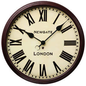
Another important shot that needed to be completed was the ‘backwards clock’ shot. While storyboarding, the idea came up about seeing a clock ticking backwards, to give the film an eerie and supernatural tone. Though potentially a simple shot, we took time in preparing it as the clock needed to be straight and in a good area of the room. We also agreed that the camera should be in line with the clock and zoomed in very near. After positioning the camera, the group pressed record and left the camera to its own devices, as much footage had to be recorded to get the full effect of the hands ticking backwards. This gap allowed us to rest and think about what other footage needed to be recorded later.

After allowing the camera to record a significant amount of footage of the clock, we set about planning for the next scene, which was intended to be the scene where the patient can’t get his clothes as smart as we would like and begins to get agitated. Two more problems occurred though, as at first the group couldn’t decide on where to film this particular scene. One argument was that James’ house was basically too nice and wouldn’t be the kind of place where someone with mental problems and inner demons would live. Another argument was that the shots weren’t interesting enough and needed to be edited before we shot. Before those arguments could be resolved however, David Huxford was too wet from the bathroom scene to film anymore in the right clothes. The clothes are obviously important as continuity must be achieved, and with his dampness, filming had to abandoned until another day.

Fortunately, not many shots remain to be filmed and we are nearing completion. The group has agreed to film yet again on Wednesday 15th December, this time with co-star George Austin as well, giving us time to film the dressing scene, a further scene with the two characters and carry out any more shots we may have missed last time or feel need to be re-shot. Hopefully, Wednesday will be our final day of filming and we can then get around to editing the shots into our final product.

Saturday, 11 December 2010

Ancillary Task - Film Posters to Influence Ours

Film posters are a major part of marketing campaigns and advertising, and can make or break a film’s success. Potential viewers of the film are usually attracted to the film by the poster. If the poster is bland and unoriginal, it will not interest people and they won’t want to see the film. However, if the poster garners immediate interest with the use of unusual images and thought-provoking taglines, it will draw awareness from the public and may convince them to go and see the film. Therefore our film poster is extremely important and we must get the correct themes and mood across to the public or our target audience will miss out on our film.

One poster that has influenced us is the poster for ‘American Psycho’ (Dir. Mary Harron, 2000). Though there are various posters for the film, this one shows main character Patrick Bateman’s lust for violence (the knife) along with his need to be seen as successful (the suit). This is similar to our main character – the patient. Though he doesn’t have a desire for violence like Patrick Bateman, he does have some deep emotional problems, but wants to hide them by looking successful and ‘ordinary’. A similar poster could be created for our film, showing our protagonist’s crazed persona along with his desperate need to be seen as ‘normal’.

While the American Psycho poster focuses on the main protagonist, other posters that have influenced us focus on unusual and intriguing images rather than characters and the actors that play them. Since our film obviously has no ‘stars’ in it, focusing on interesting images in our film may interest more of the public. The poster for the film ‘Spider’ (Dir. David Cronenberg, 2002) does have the star Ralph Fiennes on it, but it focuses more on disturbing imagery and dark, relentless colours. This poster is very murky, unveiling the film’s tone and atmosphere so that the producers can draw in their target audience. The poster sparks interest from the public and most people will take a second look at it. This is another direction our group could go down, focusing on specific imagery from our film, perhaps the blood in the sink or the backwards clock.

Another poster that has influenced us is for the film ‘American Beauty’ (Dir. Sam Mendes, 1999). Though not the same genre as our short film, the poster relies on just one image, even though the film contains two big movie stars – Kevin Spacey and Annette Bening. The image is very simple yet thought-provoking. The bright colours immediately grab the attention from people and the single image filling the whole poster has an overwhelming effect on the senses. Just from looking at the poster, the audience can tell that this film is something different and unusual to other films coming out of Hollywood. Our group may also create a poster similar in vein. By finding one specific image we could show our target audience that this film is something worth looking into as it is diverse and atypical. We should also make sure we choose the colours for the poster carefully, as colour can have a large affect on whether the public is attracted to the film. For example, since our film is a mystery thriller with a death in it, colours associated with crime and murder would be a good route to go down. Reds, browns and greys will allude the public to the tone of the film and give the poster an overbearing, envious and dirty feel. This would hopefully show people that the film is not a typical Friday night popcorn movie, but one that the audience has to engage in and think about.

Wednesday, 1 December 2010

Choosing Our Actors

Obviously for most short films, actors need to be used to develop the story and allow the audience to make a connection with the film. Our film only uses to characters, and one of them is in every scene of the film – so must be chosen carefully.

For the character of the patient, our group searched extensively for the right actor. We had described and imagined the patient as a skinny man of average height, who looks stereotypically ‘normal’ – trying to fit in. He wears shirts and ties most of the time, attempting to look smart. His main goal in life at this time is to desperately try to hide his inner demons, so he often has a stressful feel about him. Many people from our school were considered, but nothing seemed to quite fit or some were unavailable. The shooting requires quite a lot of effort and time, meaning that people’s lives were going to be interrupted for a brief time, and with mounting school work people had to decline. After much deliberation, we decided that David Huxford, one of our group members would fit the part. Though he is quite tall and perhaps not exactly the look of the patient we were looking for, he seemed enthusiastic and enthralled to be placed under the spotlight. It turned out to be quite convenient on our first few days of shooting, as David knew the story inside out and understood what emotions and mannerisms were required. As a group we are now happy with our decision and hope that audiences to our film will connect with David’s portrayal of the character.

Finding the actor to play the psychiatrist proved to be much easier. Almost as soon as our film had its basic plot and we knew a psychiatrist was going to be involved, we all had someone in mind. Our friend George Austin is very elegant and we feel has the perfect look of a psychiatrist. First of all his beard adds sophistication to the role and gives the character a father-like quality that our group thinks can be hard to find. George also owns a very stylish coat that we may incorporate into our film as it has a look of success and will hopefully give viewers an idea of experience. George also has a very masculine yet sensitive voice, which we hope he can use to his advantage in the role – being what the patient inspires to be yet also being caring and considerably ‘normal’.

Overall we as a group feel confident in our actors and hope they can have the impact we intended the characters to have from day one.

Thursday, 18 November 2010

Location Ideas

Setting and location is an important part of any film, and choosing the correct place to film can make or break the whole project. Our group has had many long discussions about where we feel the most productive location to film is. After we had our finished basic idea and had begun storyboarding, we had to decide how the particular location we would choose would affect the mood and tone of the film itself. To start with, we contemplated what the location should look like, before searching for somewhere that we already knew. For example, for the opening scene with the dead body in the bathtub, the group decided on what look we thought the bathroom should have, rather than choosing to settle on a bathroom in the home of one of the group members.

For the opening scene, we agreed that the bathroom and the bath itself had to be clinical. The body is calm, as if the prospect of death had lingered in the air for some time. To film this artistic death in an uninteresting, stereotypical family bathroom would have completely taken the impact away from this scene. Whoever the body is, this death has not been rushed and we wanted to give the bathroom the look of someone that is tidy and organised, and that his demise is just one of the things to tick off from his list of things to do on that day. A white bath with white tiles on the walls would be the perfect location for this scene. If there are any images on the walls, they may make the scene look amateur and lazy, depending on what the images are. This scene is probably the most important in our film and is our main controlling idea, so our group has decided to search thoroughly for the bathroom closest to the original ideas in our mind. In a perfect world, the bathroom would look similar to the one used in the film ‘Garden State’ (Dir. Zach Braff, 2004). At the beginning of the film, the character of Andrew ‘Large’ Largeman is heavily sedated and his whole house is very plain and clean. The walls are white, the bathroom is large and the bath itself is swallowed by the rest of the room. This use of setting was very cleverly chosen and gives the opening to the film the feeling of loneliness, but with a hint of OCD about cleanliness. The scene also has the look of purgatory, a big bland of nothing. If our scene looked similar to this, it would give the audience the feeling that the character already feels like he is on his way to death, and is just speeding up the inevitable.

Another important scene in our film is the discussion between the psychiatrist and the patient. This scene would require a psychiatrist’s office, but because we have no budget we must improvise. In our storyboard, the room is predominantly brown, with many books on shelves and a large desk. The two characters would be situated in the centre of the room in different chairs. The psychiatrist’s chair is small and comfy, making him look big and almost like a higher power. The patient’s chair is vastly different, huge and overbearing around him, making him look feeble and unimportant. This scene was well thought out throughout our group, but we realised that this location with the correct iconography would be almost impossible to find and use. Therefore, we decided that the specific chairs idea could be dropped if needed. We will continue to search for a similar-looking room. Any room that looks like it has been used daily for many years with many books or shelves could easily be seen as a psychiatrist’s office. A similar location to the one we are aiming for is in the film ‘There Will Be Blood’ (Dir. Paul Thomas Anderson, 2007). In a scene towards the end of the movie, Daniel Plainview is now very successful and living in a large house and his adopted son comes to visit him. Daniel is sitting behind a huge desk, and the room itself is also domineering and has a very arrogant feel to it. Shelves filled with books stagger the sides of the room and the walls are barely visible. A room similar to this is what we are aiming for. Of course, a room of that magnitude is most likely not going to be found by us to use, but if we could take specific elements from it our scene would come to life and be similar to the original ideas that we planned.

The title sequence is also an important scene to talk about in terms of location. The point of the title scene (apart from show our names) is to show the slowly diminishing mind of the main character. To portray this, the title sequence begins with a dolly shot of the beautiful countryside. After this shot, the images became more unattractive to the audience. The images and the main character’s mind are alike. The idea presented to us as a group was to film field and industrial based buildings as we were approaching location. The main mode of transport to get to these locations was by car (driven by Dave Waters). This then would get in the way of our shooting schedule, and it would be an extremely effective shot to use for the title sequence. One of our inspirations for this came from the Pink Floyd album ‘Animals’. The picture of just a factory and the smoke was the reason we decided to have the psyche decline in the title sequence by using images from the industrial world. The beginning of the title sequence where the beauty of nature is captured to imply sanity within the psyche of the main character is very important to capture correctly. Because of this, the location needed to be beautiful, open and easy to get to. We eventually decided to film the country side whilst within the car, to gain a really different dolly shot of the countryside. The idea for the countryside came from last year’s opening to a thriller ‘Allegiance’. The very first thing you see is the grass in a field, until the shot pans up and you see an unknown character being hanged from a tree. Instead of just the two seconds of just beauty, then shock, we plan to prolong the beauty and the depressing images to give the audience a chance to get into the mood of the film.

Overall, the locations we have chosen for our film have been chosen very specifically to allow the audience to feel the emotion we plan to emit from the scenes within our films. If the locations aren’t what we plan them to be like, our film won’t have the same emotion and it won’t be as effective. Based on this, location is very important to our project, and following the guide which we have set for our group would be very wise indeed.

Monday, 15 November 2010

Hypothesis for Questionnaire

For our questionnaire the group decided that it needed to be specific and bold if it was going to be any real use to us. We decided to build up a hypothesis of precisely what people we would ask. People outside of media studies don’t tend to watch short films, as they are hard to access and don’t have a large demographic to aim at. Because of this we decided to ask people outside of media studies so that we could gain an insight into what casual film watchers would look for or would interest them if short films were more easily available. By finding this out, it would also allow us to market our film better to casual film viewers outside of media and film production with posters and magazine reviews that have to be completed in the ancillary tasks.


From the answers we got it is clear to see that the majority of people would not watch a short film out of choice. If they did watch one, they would prefer to watch it in a cinema before the feature film. The most likely reason for this is that it wouldn’t require any extra effort from the viewer as they are already at the cinema, and also the film would likely be the same genre as the feature film. Most would also be willing to watch a short film on YouTube rather than TV, for example.

Of the thriller sub genres, it would seem that people would rather watch a psychological thriller than a horror. Perhaps this is due to the fact that the Horror genre has been worn-out to the extent where these thriller hybrids are becoming somewhat cliché and thereby dull. Therefore, one could argue that the more contemporary thriller enthusiast likes how the human mind works, incorporated within a narrative full of enigmas and twists.

However, from our questionnaire, we also formulated data which suggested that the conventional thriller fan prefers realist narratives opposed to surrealism. This would suggest that although perhaps the simplicity of the horror/thriller may be a dying breed, audiences still enjoy a simple narrative that can keep them engaged, yet perhaps with a twist that will not disrupt the flow of the narrative.

Overall, when looking back upon the early hypothesis devised by Taylor Gladwin, the questionnaire closely reflects his notions above (with some slight variations).However, from this piece of data collection, we can now modify our marketing strategies, and perhaps showcase our short before a feature film of the same genre. The audience would therefore feel inclined to watch our short as it would bear little or no effort to watch. We can also back-track to our storyboard, and slightly tweak the narrative to meet our demographic requirements.

Thursday, 11 November 2010

Potential BBFC Rating for our Short Film

Though most short films are not shown in cinemas, our group have agreed that we should decide on a BBFC classification rating for our product. Hopefully in the near future short films will be shown before features in cinemas, allowing young, budding directors and screenplay writers to make themselves known. Should this or something similar develop, short films will have to be rated within a particular age range.

After finishing our storyboard and having a clear image in our minds of how our film will look and feel, we decided to discuss the rating. Though our film will most likely not contain swearing, as it usually sounds tacky and forced in low-budget films, we agreed that the tone of the film would push it above a rating of 12. Dealing with death and themes of identity and masculinity, the film will be too advanced for younger viewers, and our target audience ranges from late teens to mid-adults. Therefore we agreed as a group to rate our film a 15. We decided that a rating of 18 would be too high, as there is no strong bloody violence or hard drug use – typical features in 18 rated films.

By rating our film a 15, it would obviously allow a larger age range of people to see it and hopefully get better distribution.

Initial Ideas For Title Sequence

After careful deliberation within our group, we decided that a well-filmed title sequence would be an exquisite extract to add to our film. Many of our group’s members favourites films have excellent opening credit sequences, and we all believe that having a good title sequence adds to the films mood and gives the audience an idea of what to expect later on. We also proposed the idea of having a title sequence completely opposite to our film’s mood, to throw audiences off, so that when certain events happened in the film they would become more shocked and surprised. This idea was well thought out at first, but fell through and we decided to create a simpler title sequence, but with interesting and provocative images behind the credits.

We took influence from the opening sequence of ‘This Is England’ (Dir. Shane Meadows, 2006). Though not in the same genre as our film, the opening credit sequence intrigued us a lot. The images are all of England itself, starting off with happy images, but slowly drifting to ones of misery and despair. We thought that this technique was very effective, and thought that we could use a similar method for our opening sequence, to show our protagonists psyche and his view upon the outside world. Rather than using images of England, we thought we could get images of particular places. For example, for the opening shots which will be ‘happier’, we could get shots of trees in autumn and children playing in the park. As the shots get darker and more distressing, we would use shots of dismantled houses and shoddy wastelands. We agreed that this sequence would set the tone for our short film and give audiences an idea of what to expect from the next five minutes of footage.

Another title sequence that our group took influence from is from the film ‘Alien’ (Dir. Ridley Scott, 1979). The opening sequence was very minimalist non-diegetic sound, and the word ‘alien’ slowly comes together on the screen. As the letters piece together, the suspense gets cranked up and as the word is finally complete, the viewer is shown the spaceship on which the later destruction will happen. This opening sequence was very influential on our group, and we especially liked the use of minimalist sound. We agree that a particular song or a lot of non-diegetic sound over the images in the credits would not set the mood as we would like, and we would most likely not get the desired reaction from the audience to the images being shown. Because of this, we have agreed that the least amount of non-diegetic sound would be the best way to open the film and set the mood.


Dr. Strangelove

Although classed as an old gem in cinema history, Dr. Strangelove was one of the first of its kind to employ a title sequence at the beginning of a film. What I have learnt from this preliminary research is that it must reflect the genre at hand, a trait Dr. Strangelove captures perfectly, as a B-52 bomber “mounts” a KC-135 Tanker in mid-flight.
The remaining reasons I have pursued this film as inspiration for our title sequence concerns it overwhelming simplicity, yet maintaining dynamic impact all the same. So although we may not necessarily incorporate planes within our opening sequence, soaring through the air, we plan on capturing this simplicity in a way that anchors and reflects our psychological thriller genre. In terms of sound, the contrapuntal, American alteristic non- diegetic sound serves as an effective anchorage for the upcoming film, as this could satire the stupidity of war, and the fact it is ever going and omnipresent.


Watchmen

Watchman, on the other hand, presents a new, jaded world. This is fundamentally captured through the cinematic frameworks, that being mise-en-scene, editing, cinematography and sound. The title sequence suggests how life has fallen through new tangents, which has thereby altered society’s minds and perception upon the world. As a result, this universally affects the psyche, something that co-links with our films genre. The sequence fundamentally presents the beauty and malevolence in life all wrapped into- the torn disposition of our protagonist.

This theme entwines with the over-dubbed non-diegetic sound of Bob Dylan’s The Times Are-A Changing, a song which lyrically mirrors how people are progressing too fast for the world, which will inevitably lead to its downfall. This similarly anchors our protagonist’s psyche, someone who cannot keep up with the world’s progress, and therefore slips between the cracks of life.

In this sense, the opening sequence should serve as some form of metaphor for the lead protagonist; so therefore, it should mirror the genre, our patient and the world within our film.

The only chink in the armour here concerns the complexity of Watchmen’s opening title sequence, rife with special effects and CIG. It appears however that dynamic impact can also be presented through simplicity, as seen in Dr. Strangelove. Therefore, we will have to entwine features from both film’s title sequences.

Friday, 5 November 2010

Themes to be Exemplified in our Short Film

Since our short film has had a long pre-production process involving some very deep discussions, our group has deliberated which particular themes will be represented in our film. I have highlighted three main themes that we as a group think will define our film and be assessed throughout the narrative.

One theme that we think is very important is masculinity. This is a big part of everyday life for most males – the struggle to be seen as strong to other people. In our film, the patient is desperate to be seen as ‘normal’ to others. He despises that he has to be in therapy and feels weak because he can’t deal with his life on his own and has to employ the services of a psychiatrist. Because of this he feels the need to dress smart, to look successful to others. He has no close friends, and desperately craves the attention from others so that he can feel human again, and particularly feel like a man. These feelings have not been helped by media encouragement. The media, including in real life, promotes traditional masculinity in our culture. Men are encouraged to celebrate stereotypical ‘male’ activities such as violence, fast cars and alcohol. This is shown in the film ‘Fight Club’ (Dir. David Fincher, 1999) where the characters of the narrator and Tyler Durden create a ‘club’ where men fight each other bare knuckle until someone gives up. Tyler believes this shows masculinity, exemplified in his quote “how much can you know about yourself if you’ve never been in a fight?” This shows the stereotypical nature of man, and how they seek power by any means necessary. If our film was a full feature length and the patient’s back story was explained, the audience would probably see him struggling to live up to the stereotypical man, and not understanding why every man in a magazine or in adverts look so similar – handsome, tall and well-preserved. Because the patient is not even remotely like this, he feels inadequate and his inner demons are highlighted even more.

Another important theme that will be explored in our film is the definition of identity. This is a consistent theme in thriller films, especially psychological ones. Characters usually struggle to define who they are and try to discover their true self. This is shown in the film ‘Shutter Island’ (Dir. Martin Scorsese, 2010). The protagonist in the film has to thinks he has discovered a diabolical web of lies and seeks to find the truth, but ends up finding out more about himself than he ever wanted. The protagonist (the patient) in our film has a similar problem. Though he knows who he is, it is not the person he truly wants to be. He feels that everything he does is done without his mind agreeing first, as if his body just acts and he has no time to stop and think before. This disconnection between body and mind gives the patient the feeling that he is not in control of his own life and has no sense of where he is going. To know how he wants his future to plan out, he has to lose this numbness to himself that he feels every day. Again, if our film was feature length it would most likely explore why the patient went to therapy in the first place, and would show him embracing therapy at first, believing that it would cure him. Our group have agreed that our film will address this theme as it will create intriguing enigmas among viewers and give it a dark undertone that we feel will suck the audience into the dilemmas that the patient is facing.

The final important theme that our film will address if the theme of existence and purpose. This is another theme that is quite common among thriller films in general, as characters struggle to find what the meaning of their particular life is and strive to find their reason for existence. In our film, the patient is looking for his purpose. Similar to the theme of identity discussed above, he feels that his life is pointless and that he is just a pawn in an evil game. We as a group have not decided whether the patient believes in God or an afterlife of any kind, but if he did he would most likely feel that he was put on this earth to be laughed at from above. It may seem a bit extravagant, but the patient feels that he should be ordinary, and ordinary people don’t lead the kind of life that he is leading. Every day that he lives, he comes second best and sees people that are far more successful and superior in every way than him. Our group feel that this theme will grab the viewer’s attention, as it is something that all people have felt at some point in their lives. Everyone wants to know why they are here and/or what purpose they have on this earth. We feel that by referencing this psychological state of the patient, audiences will feel more connected to him, though he is an outcast.

Overall, we as a group think that these themes are all interesting and will give our film broader dynamics to be explored. Our film will now hopefully feel and look much more sophisticated than most other low-budget short films and will set us apart from the rest, allowing us to hopefully be noticed and get our film distributed further than expected.

Thursday, 4 November 2010

Initial Ideas For Costume

As referred to in previous posts, from very early on in our thought process our group decided that the main characters in our film needed to be interesting with particular quirks, rather than bland and repetitive – something seen in most Sixth Form produced short films. As ideas propped up and our main idea began to take shape, so did the look and feel of our two main characters – the patient and the psychiatrist. Though still currently nameless, all of us have quite a clear image of what these people will look like and how they will act. This post will focus on the potential costume and look of the two characters, and how we intend to use particular items to manipulate a designated audience reaction.

Our protagonist, who will be referred as ‘the patient’, has gone through many incarnations throughout pre-production, starting off as a basic man with typical problems that therapy would usually help with. He has developed into a complex person with some interesting hidden agendas. After the patient grew into the character we wanted him to be, our group had a long discussion about how he should look and why. After a couple of generic ideas, we thought of some clothing that would work very well with a particular scene that had already been storyboarded. The scene involves the patient slowly getting dressed, as the clock in the room is ticking backwards, and gaining momentum while getting louder and louder. The patient will get very stressed before finally lashing out. Our group had decided early that the patient has inner problems but desperately craves to be ‘normal’ on the outside. Because of this, we decided that he would want to dress smart most of the time, as if by doing that he would seem important to the outside world. But the patient can’t quite get as smart as he would like, as he has a distinct scruffy look about him, and his ‘smartness ‘will never be as elegant as he wants. So in the scene mentioned above, the patient will be getting dressed into particular smart items, such as stylish trouser and a shirt and tie. But as the clock ticks backwards and the pulsating sound invades his mind deeper and deeper, he will become agitated and rip his shirt or tie, perhaps signalling that he has had enough and just wants to get out of his diseased conscience and explore his fragile inner world.

Our group agreed that this idea for costume was very interesting and would raise a lot of enigmas among audiences, so we decided that the patient would be wearing smart clothes in every scene he is in. A selection of shirts and ties will give the impression that the patient tries to work hard on his appearance and has various outfits, as if that he feels that’s what most ‘successful’ people do, and desperately wants to be like them. This can be compared to one of my favourite films ‘American Psycho’ (Dir. Mary Harron, 2000), where the protagonist Patrick Bateman always has to look his best and be seen in the most expensive restaurants to show his power and how successful he is. Patrick can never stand to be second best, and when fellow co-worker Paul Allen shows off his impressive new business card, something with as little meaning as that to the rest of the world is the kind of thing that puts Patrick in dismay, and he happily kills Paul with an axe shortly after. Our character has similar feelings, though not quite as extravagant. He feels inadequate that he has to be in therapy, as all he wants is to be seen as normal with no distinct problems. By being in therapy this is ruining his idea of an ordinary life, and he feels the psychiatrist is standing in the way of his happiness.

Overall, our group feels that the character of the patient is a very interesting one that audiences will be intrigued by and will maybe see a small part of themselves in him.

Our other main character in our film is the psychiatrist. Our group has not developed this character nearly as much as the patient, as the psychiatrist will not have that much screen time, but will still play a major role in our film. The main scene that he will command will be when he is talking to the patient in his office during a therapy session. This will likely be the scene with the most dialogue, and we feel this scene needs to show the psychiatrists hold over the patient.

The psychiatrists costume will look basic, but we hope that by choosing the correct colours and general look, he will have a dark undertone about him. Most psychiatrists wear normal clothes, usually smart-casual. As a group we thought that either a pair of jeans or semi-smart trousers would be adequate, along with a casual shirt underneath a dark jumper. The psychiatrist wants to make his patients feel calm around him, so doesn’t dress over the top. The jumper could be the colour of brown, as that usually symbolizes friendliness and trust, which the psychiatrist wants to establish with his patients. The trousers will also be dark, most likely black.

This costume may seem generic to some, but we as a group feel that by dressing like this, the psychiatrist also wants to be ‘normal’, or what he believes being normal is. After doing his job for quite some time, he feels like he has connected too much to his patients over the years and is now just as damaged as they are. He wants to act as regular as possible, since he doesn’t have many friends and perhaps by dressing in a ‘friendly’ way, his patients might befriend him and he will be able to have a typical relationship that stereotypical ‘normal’ people have. Our group feels that by having this similar connection hidden inside both main characters, the final outcome will have almost an ironic feel to it, as the other person is what each of them have been looking for, they just didn’t know it because they were both too afraid to share such deep emotions with others.

Wednesday, 3 November 2010

Initial Ideas For Iconography

Though our final idea is not yet completed, it is very nearly there and we have many specific visions for our film in place. An extremely important part of any film is iconography. It subtly tells the audience how to feel about a particular character or place, and can also show what a character’s quirks are and what they may really me thinking on the inside.

One important piece of iconography in our short film will be the plug socket, which will be our very first shot. The first shot of any film can be vitally important, and we wanted ours to create instant enigmas for the audience and make them pay attention from the word go. When seeing a plug socket, people will instantly think of electricity and perhaps electrocution. There will most likely be no sound used during this shot and the pan that will follow, making the audience feel on edge and wonder whether the plug socket has not been used safely and perhaps fatally.

The shot of the plug socket will then drift to the wire connected to it, and through the use of steadycam, the camera will follow the wire until the audience is able to see a radio in the bath and a man’s leg on display. The audience should then assume correctly that the man is not and has been killed by electrocuting himself with the radio in the bath. Two very important pieces of iconography will be used and highlighted here - the radio and the bath itself.

The radio is a very important piece of iconography as it is the cause of death for the person, and will stay in the minds of the audience throughout the short film. It is one of two controlling ideas, and is an important image. Our group has agreed that the radio needs to have a ‘used’ look, as if the character is a fan of radio and prefers its old-time feel to new technology like IPods. This will also become clear as the radio will need the use of a plug, which shows that the radio is slightly old, as new ones are able to go into water.

The other controlling idea in our short film is the bath tub. This is the scene of the death and is another image that will stay in the minds of viewers throughout the film. We have decided that the bath, and the bathroom itself will very clinical, hopefully white with a very bare look to it. This will hopefully give the room a new-look feel, or perhaps show that a particular character is very clean and prefers everything tidy and in place. The look of the bath will hopefully create enigmas for the audience and make them wonder why the room has such a purgatory look.

Another important piece of iconography to be used in our film is the clock in the patient’s home. Our group came up with an idea that throughout the film, when the clock is in view it will tick backwards. Obviously, this will create enigmas for the audience, but we liked the idea that it shows the patient’s psyche and how fragile he is on the inside. The clock shows his mind steadily ticking away, without the knowledge of anyone else, and how much time he has before he completely cracks. We as a group think this could be a very startling image and one of the defining shots of our short film, the kind of image that people will remember and recognise the film by.

A slightly less important piece of iconography that we will use is a razor. Though this will only be visible for brief moments in our film, we feel it gives a small insight into the mind of our protagonist. This will not be a conventional razor, but rather one similar to the one used in ‘Sweeney Todd: The Demon Barber Of Fleet Street’ (Dir. Tim Burton, 2007). Because the razor will be vastly unusual to generic razors used and often seen in thriller films, we believe this will put the audience on edge. It will also give a brief view into the mind of the patient, and shows that he does not like generic, normal items and likes to be over-the-top and have significance in his life. He despises being like everyone else and deep down likes going to a psychiatrist as it shows he is not conventionally ‘normal’. This will further show his frustration of finding out he does have problems and that no progress is being made in therapy, leading to his ‘act’.

Overall, iconography is going to be a very important part of our film and something that we must make sure we get right. If the correct iconography is used fittingly, then our film will have the precise look and feel and hopefully we will get the desired reaction from the audience that we are hoping for.