 When deliberating as to what posters I should analyse within the confines of the psychological/thriller genre, I decided to delve straight away into M. Night Shyamalan’s 2010 production dubbed “Devil”. Watching the picture in September I can happily reserve judgement on the films quality, while essentially focusing the films chief ideas, and how these notions are reflected through their posters.
 On a mere, one dimensional basis, what I picked up from this filmic experience was the notion that evil can quite simply lurk in all of us, whether that lies at work, with family, friends, or in this case, a geriatric.
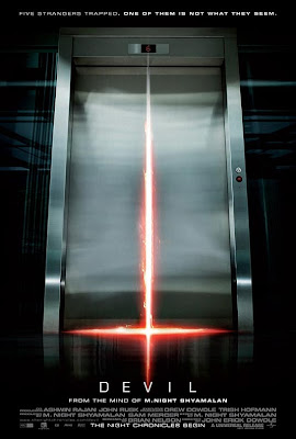
In this case, I truly feel the poster anchors this central notion quite reflectively. The cold, frantically oozing red light instantaneously suggests danger on the most fundamental level. When analysed further, the red light clasping around the crevice is shaped in the form of the cross, which is thereby symbolic of Jesus’ death, and grounds the film in terms of religious wrong-doing.
The fact that the doors are shut was the most prominent reasoning behind choosing this poster however. From what I have written about above the overwhelming theme of evil is present within the lift. This should thereby disturb the audience’s psyche somewhat, initially leaving them to question who or what lies behind the door. When watching the film, I feel that the posters low key lighting even manages to capture the bleakness in each of the films characters, from the rip-off merchant, to the volatile security guard.
It is important to notice that within the psychological/thriller genre, all their posters seem to adopt incredibly short and dynamic taglines. This stems all the way back to films such as Alfred Hitchcock’s Psycho (1960) - "Check in. Relax. Take a shower” in order to shift the focus on the lift, which is the films pivotal instrument, as well as leaving the audience somewhat cut-off, in a way which they will yearn for more.
It would seem then that the overall impression behind posters such as Devil is to leave audiences with an incredibly blunt snippet of what could be an incredibly complex, elaborate film-in order to leave audiences feeling cold and emotionally detached from the world outside the film.

For my second psychological thriller film poster I decided to analyse Christopher Nolan’s narrative warping classic Memento. Written and directed in 2000, the film centres on Leonard Shelby, a man with anterograde amnesia who is unable to render new memories, yet completely driven to lay a path of vengeance towards the man who raped and murdered his wife.
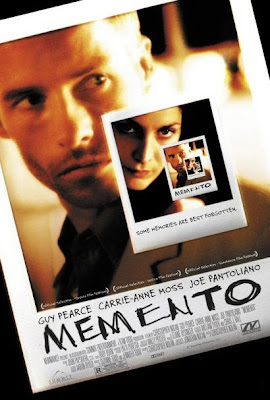
What initially struck me as somewhat interesting was the use of Polaroid photographs to formulate the poster. Once watching the film, the audience are aware that the life that Leonard Shelby once lived has now faded into the past, so to some extent, the pictures should almost strike the audience as a singular frozen moment in time, something Leonard, nor the audience should never forget.
While remembering something such as a photo may not entice the audience, it is also important to analyse the copy-“MEMENTO”. The writing itself is incredibly rugged and almost embedded into the photo quite forcefully. This should accumulate pre-conceived notions in the audiences’ minds of an incredibly frenetic, impulsive anger, and when coupled up with the incredibly tense NVC (non-verbal-communication) that this concentrated moment in time will involve some type of sickening vendetta.
Once again, the poster adopts a snappy dynamic tagline dubbed- “some memories are best forgotten”. This sense of ambiguity should raise questions in the audiences mind concerning these memories, and what the future should hold for these two people within the shots.

Similar to the two films above, Secret Window is a 2004 psychological thriller film directed by David Koepp.
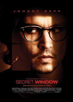
Similar to Devil, the posters copy is flourished in a very sickening, oozing red. What struck me was how the typeface for “window” is almost smudged and disfigured, which should instantly evoke audience reaction, as something in this poster is evidently blemished, which in some sense anchors the films plotline.
This generic uneasiness and danger is furthermore anchored through Johnny Depp’s NVC. This is reinforced by the fact that the shot is a close-up, which should emphasise some sense of claustrophobia or paranoia. I think it is also incredibly interesting how the window pane almost breaks his face into quarters, which could connote a sense of a dual personality, which is truly reflective of the films narrative plot.
As a whole, I would conclude by stating that this psychological thriller poster has been incredibly ingenious, in the sense that it unfolds a lot about the plots narrative course while simultaneously concealing anything too important. For instance, Depp looks neither volatile nor vulnerable, yet the red danger-connoting slewed copy would simply suggest that he is unstable. The fact he is partially concealed behind a jaded shadow could propose that he is hiding as a victim, or a felon. If this psychological/thriller captures anything in the audiences mind, it would be an overwhelming sense of ambiguity and unease, a suitable catalyst for any passionate thriller fan.
No comments:
Post a Comment