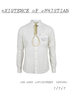
One of our group’s ancilliry tasks was todesign a film poster for our film. This is to be completed with a magazine review of our film after the film has been completed. The finished 1st draft looks blank at first glance, but initially the production towards this draft culminates all of the factors in which we want from our short film.


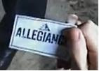
 To begin with, the title of our film came after a long and thoughtful discussion with members ofthe group and others that we know. We got the existence part of the film as our film shows thefinal moments of our character, who is eventuallymurdered by the psychiatristin our film, but it is made out to look like suicide throughout the film. Then we want a very average name to contemplate the mood that we wished to create in our film, to which we decided on the name ‘Christian’. Coincidentally, one of the people that gave us the idea for this was a friend of our named ‘Christian’. The slight faded effect of the writing was inspired from the card that we used in the AS film opening ‘Allegiance’,as well as the fact that it represents the slowly declining mind of the main character
.

On top of the title, the tagline to go with the poster needed to alert audiences of the film’s release, but it also needs to be connected with the film in some way. Because of this, I decided to make the style of writing the same as the main title (the 1st letter in small case, the rest in capitals with white spray paint to give it a faded effect). Because the story involves a patient having meetings with his psychiatrist, I decided on ‘Our next appointment is…’ as clever intertextuality between the poster and the short film. My main inspiration for this style of writing was from the same sort of style use in the film ‘eXistenZ (1999, Dir. David Crohenberg)’. It creates as sort of mental feel to the poster, as well as reflects the psyche of the mind of the main character.

Hopefully, some of the ideas used in this poster will be incorporated into the final poster used to present our film to audiences. Otherwise, if we do decide this poster to use, the group can add things to the poster to make it more appealing to audiences. This I hope will give us a better chance of gaining a better grade in the ancilliry tasks.
No comments:
Post a Comment