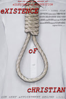
 For the title sequence, I made sure that the font was the same as in the poster, to make the branding of our film more effective. I wanted to make the titles animated so that they looked dynamic, however I didn’t want it to distract the audience, or look to cartoonish or clichéd. I therefore opted to make the letters appear on screen left-to-right. This gives the film some momentum from the start but still looks stylish and not amateurish.
I had the advantage of having chosen the music before I started editing the film, therefore I was able to match the film up to the non-diegetic sound. I edited some of the static shots we took from the countryside into the titles so that they matched up with the percussion section of the soundtrack. This is extremely effective, planting enigmas and giving the whole film a slick feel.
Inspired by the film Hard Rain (1998, Mikael Salomon) - which I thought made excellent use of its mise-en-scene despite not being a great film in itself – I used the sound of rain falling on the camera over the non diegetic soundtrack at the beginning of our film. This makes the film more atmospheric and moody.
I veered away from the storyboard slightly with the opening sequence, fading the shots of the hand writing the suicide note over the shot of Christian at a desk, and also the shot of the note on the door and the body in the bath. This misleads the audience, making them assume that he is the one writing the note. I used the subtle effect ‘dream glow’ over these shots, which effectively heightens the contrast of the shots and adds a slight blur. It is a subtle effect, but it gives the shots a soft focus which instinctively leads the audience to believe that it is some sort of flashback.
From the start, we intended to have a radio extract with some sort of news report over the top of this sequence, however we had a lot of difficulties recording this. We could not get any of the recording equipment in school or in any of our houses to work, until it was suggested that I record it on my phone. This seemed like a bad idea initially, however it turned out that it worked far better than we could have imagined as the poor quality of the recording added to the effect of it being on the radio and meant that we didn’t have to mess around adding crackling effects etc to the recording as intended originally. I also continued the sound of the rain throughout this scene, adding to the atmosphere and also the dream-like quality of the scene with the long fades etc.
For the scene where Christian is getting dressed and the shaving scene, I decided against using a non-diegetic soundtrack as I felt that it would distract the audience, or indeed make the whole film into a music video. We wanted this section of the film to be slow-paced to reflect the fact that the protagonist is contemplating, possibly suicide.
The sound on the shot of the blood in the sink had to be replaced with sound effects of a dripping tap, as the tripod we used for that shot was slightly squeaky, however this was not a huge issue.
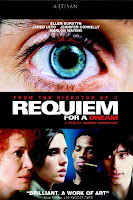
 The section with the rapid editing was intended to show the Christian’s loss of sanity, as he looks in the mirror contemplating. For this section I was inspired by the film Requiem For a Dream (2000, Darren Aronofsky), which uses rapid editing of close-ups with pleonastic sound to highlight the different character’s addictions.
 Here, I used a similar technique to show the turmoil going on inside Christian’s head, until he finally screams out. Whether these scenes are ‘real’ or not could be interpreted both ways by the viewer. It could be interpreted to be his vision of hell inside his head, in which he is running away from his bleak reality; or it could be a real traumatic scene which he is recalling.
Initially, I was going to use fades to black between the bedroom shot and the bathroom shot, and also for the transition to the psychiatrist sequence, however I felt that simple cuts were more effective, especially after a long fade to black from the previous sequence (into the bedroom sequence) as it gave a sense of waking up from a dream, and gave the whole sequence a more realistic feel while he is in his house.
For the dialogue sequence and the shots where the psychiatrist is walking to the door and knocking, it was simply a case of using continuity editing that we learned last year.
For the section where he is being told to close his eyes, I used long fades of different shots from the same position to create the illusion of seeing double, in order to make it look like he is being drugged. I slowed down the point of view shot to enhance this effect.
The end sequence was simply a case of making sure that the non-diegetic soundtrack matched up with the shots as the fact that Christian was in fact murdered is revealed to the audience.
Once again, with the end credits I didn’t want any animations that looked amateurish, so I used a simple fade, making sure the font is once again the same.
Some shots I decided to discard included the idea of a clock ticking backwards, which although easy to implement, was not very effective when I included it in the film. We also intended to have a long shot of Christian running and disappearing into the fog, however this would have meant waiting for another foggy day after our first day of filming was lost, so we couldn’t include this.

No comments:
Post a Comment