Sunday, 9 January 2011

A2 Media Blog - The Journey

For the year thirteen media blog, Mr. Sheriff (head of the media department) said that we should make this year’s blog like a journey. He told us to say how we had evolved from the process from the beginning of the project to the very end. This is to re iterate that journey, and what it has done for our media group.

This whole journey really began at the end of the year 12 media blog, when we had to complete the beginning 2 minutes of a thriller genre film. Back then the media group consisted of David Huxford, Taylor Gladwin, Bradley Hart and Tom Winn. We were initially known as ‘Thumbman Productions back then. This was what we were able to base a lot of this year’s blog stuff on (because we had already done it before). But this year was different, because Brad and Tom Winn wanted to do a music video instead of a short film; me and Taylor partnered ourselves with Dave Waters and James Moss. These two were partnered with Justine Carron and Rachael McClure, and were collectively known as ‘Angry Productions’.

 At the beginning of this task, once we had gotten allot he groups sorted out and everyone was ready to go, we researched a lot of short films with Mr. Marshall. Because unlike last year our short film didn’t have one set genre, we researched many films of different genres. Many of these films include ‘The Black Button’, ‘Doodlebug’ and ‘Schwarzfahrer’ (personally research). On top of this, we watched short films that had been created by last year’s year 13 students.


Because ‘Thumbman Productions’ was the group that gained the best mark in the task last year (with an overall score of 92/100), me and Taylor thought our selves rather lucky to partner ourselves with two students that received A grades in both the exam and the coursework just as we did (after Dave Huxford’s re-sit). But because of the huge success of last year from both Thumbman Productions and Angry Productions, we wanted to beat the group that got the best grade last year for the same task, and that group was the ‘Pete McLaughlin group’. There overall score for both blog and video was 93/100 (and 6 marks had been deducted from the scores before this grade was published). This gave us great motivation to get this blog to be as best as it possibly be. However, it didn’t start out as we had planned.

The first thing we planned to get started on (much like every other group in the year) was the controlling idea of our short film. The idea being that once we had a solid idea of what the film would be based on, the actual ideas of what the film would have in it would evolve with rapid succession. But, we couldn’t think of an idea. We developed many ideas of a good short film that was a good genre; as well have challenging themes so the audience could enjoy the experience even more. But as we continued to think, we couldn’t think of a controlling idea and the longer we thought, the more groups that thought of their controlling idea and got cracking on with storyboarding their final idea. Because we took so long getting our controlling idea, we didn’t get our storyboarded idea completed until the end of October.

Getting started on the blog was also not as simple as we all had originally intended. We had accepted that we had to spend time researching short films and what we were to put on the blog, but because of the time it took to get our idea set in stone, other blogs had gotten up to 10 blog posts, and we had just managed to begin our blog with an introduction. We tried to begin with what we had done last year and how it was going to be the bass of what we plan to do this year. But rather miraculously, we’d managed to get our act together enough to get more blog posts up to catch up with the other groups in the year.

As one blog post turned to ten, and ten turned to many more, we thought our group was in the driver’s seat. Wit a lot of our research done, we still hadn’t completed the main concept of our coursework, the storyboard with our final idea on it. So as we had basically all of our research completed, we spent the remained of our time working on our soon to be completed storyboard. With the storyboard finally completed after a strenuous amount of energy and time doing this task, we had all felt it worth it when w al felt like we had given ourselves a very good idea for a 5 minutes short film, which would give us a really big chance of beating last year’s best blog.

But it was around this point in the task where stress takes over the body, and this lead to many arguments about the blog was being unleashed on the group. The main problem was the fact that some people were getting more blog posts than others, and group members were complaining that they weren’t getting enough, and this would lead them to getting not a good enough grade at the end of this project. These arguments lasted through the media lessons whilst we were planning, but these eventually cooled over and things were back on track to completing this task.

So with the planning done, storyboarding completed and enough blog posts to have a comfortable place in the packing order of the media blogs, we finally got our act together and began shooting. With Dave Waters being the only member of our group able to drive, we relied a lot on him to get us from location to location, and to get some really good shots of the countryside from the car. After getting all of the outdoor shot that we needed done, we went to the locations to which we would film our indoor shots. We had decided our indoor shot quite tentatively as we didn’t want to venture all over the area searching for the perfect bathroom t use, so we used James Moss’ house, because of what it had to offer as well as its prime location right next to the school. After 5 days of filming (spread out over a long period of time) we had gotten enough footage to begin editing our final product. But we came across many distractions whilst filming at James’ house, the biggest being his PlayStation3. With games such as Red Dead Redemption and Fifa 11, sometimes we didn’t do as much filming as we had hoped, and played too much. This hindered the project a lot because we needed to come back other days, days which we could have spent doing something more time efficient and work efficient.


With time running out on us, and everyone else was finishing up their final products, we left the editing up to Dave Waters because he had the same editing software as the school, so when us as a group couldn’t edit the product, he could. With the final week of the project ahead of us as we headed past the Christmas period, we decided to put ourselves into full throttle to get this done before the deadline. But the relentlessness of the project kept pushing our buttons, and the final two days proved to be the biggest push to finish we’d had so far.

As we went to edit the final clips into the final project, we tried to find the country side shots we had filmed on our first day of filming. However, we found the file, but it would open, the file was corrupted. So we needed to film all of the stuff we had before again, and because it was raining outside, the moral of the team was at its all time low. But we had managed to get all that we needed done for that day done; all we needed was the voice recording for the radio scenes. But once again, something had to go wrong again. Somehow we didn’t have the correct software to record what we needed for this final part of the journey. The pressure was especially on at this point because the project was due in the next day, so now wasn’t the time to be making any mistakes or not have what we needed. Eventually, we decided to use my Nokia phone voice recorder to record and upload the recording. To be honest, it worked a lot better on the phone’s voice recorder because it gave the recording the effect that it was actually being played on the radio.

Towards the end after the video had been edited, we needed a trailer to encourage our films success through viral marketing. But due to running out of time, we couldn't make one for our finished product. However, this wasn't a massive blow as all short films don't have trailers. But though it would have been nice to have made one, the process did teach us all to be more time efficient as well as to get things done earlier to make room for things such as the trailer.

But alas, after 4 months of thinking, analysing, processing, filming, blogging, arguing and breathing one heavy sigh of relief, we (as a group) are confident enough to say we are finished the A2 media coursework. But after this whole process, the journey from the beginning to the end has played a key role in this entire project. It has not only allowed us to bond as a team, but also it taught us lessons about how to organise our time better and how to work better as a cohesive unit. However, the few of us that wish to go into a field that requires this kind of ability, we will be able to look back at this journey and say that this was a significant part of what every film, advert and video that we create from here on in. But a small part of us are sad that this project is over, with the ability to leave lesson to go round someone’s house and film to create something that could be your claim to fame is saddening, but once we receive the grade that we hopefully deserve, we’ll know that the journey from sufferers to successes would have been worth it all.

Saturday, 8 January 2011

Evaluation Question 4 - How did you use media technologies in the construction and research, planning and evaluating stages?

This evaluation is very similar to the evaluation question we had to complete in Year 12. Because of this, a post it presentation was the way in which we decided to portray this presentation. The presentation was divided into two categories - TV and Internet, which was spread out over 4 sections: TV as a whole; social network sites; video sites and search engines. This is the final product:

Evaluation Question 3 - What have you learned from your audience feedback? (Part 3)


Evaluation Question 3 - What have you learned from your audience feedback? (Part 2)


Evaluation Question 3 - What have you learned from Audience Feedback? (Part 1)

Once the filming process was at its final phase, the group decided to edit the raw footage we had all in one day and display our short to a selected group of people (whether that be family, friends etc). In some of the most primitive stages of this coursework, we constructed a brief questionnaire on what our target audience would expect from a short psychological/thriller, which really helped us conceive a firmer understanding of the requirements we needed to fulfil when creating our short. This evaluation therefore serves an extremely similar purpose, whereby we let selected people fill in the questionnaire, so if ever faced with a similar task, we can continuously better ourselves through constructive, beneficial feedback.

Questionnaire
1)      Gender
2)      Age
3)      Did you understand the shorts presented themes?
4)      Did the short keep you interested throughout?
5)      Would our short influence you to watch others in the future?
6)      How did the short compare to professional pieces of media?
7)      Did the selected soundtrack keep you enticed throughout?
8)      Was the short aesthetically pleasing?
9)      Was the shorts storyline hard to follow?
10)   Would you recommend “Existence of Christian” to friends of your age?


The predominant notion of the questionnaire was to address 21 untrained friends, family and students, so they can express their thoughts upon the “Existence of Christian”. This way, we will be able to confront a demographic that is over Taylor’s BBFC rating, full of people that have to decide with their instincts opposed to a trained eye.  As a whole, we may perhaps be able to grasp different dimensions of positives and negatives that we would usually have dismissed.
For results scroll up.


Evaluation Question 2 - How effective is the combination of your main product and ancillary tasks?


Evaluation Question 1 - In what ways does your media product use, develop or challenge forms and conventions of real media products?

Title Of Film: Our group thought long and hard about the title of our film, and we agreed we wanted to steer clear of conventional and unoriginal titles. During the previous year of media studies, almost every group’s thriller had a typical one word title that was bland and cliché. The group last year tried to incorporate a long-winded title but nothing seemed to stick, so they went with a one-word title also. This year, our film was much more developed and thought-out. We agreed that an interesting title would be needed to catch people’s eye because of the unusual nature of our plot. I researched other films with longer, interesting titles and found that members of the group that hadn’t seen them were more interested in them than ones with simple, one word names. We all felt that films like ‘The Butterfly Effect’ (Dir. Eric Bress & J. Mackye Gruber, 2004), ‘Eternal Sunshine Of The Spotless Mind’ (Dir. Michel Gondry, 2004) and ‘Catch Me If You Can’ (Dir. Steven Spielberg, 2002) caught our attention much more than uninspired titles. After careful deliberation we settled on ‘Existence Of Christian’. Not only does the title create enigmas throughout audience members, it can also be seen to have a double meaning. Not only is Christian the name of the protagonist, it is also the name of a major religion. Our film has many hidden unanswered questions woven beneath the surface and the protagonist questions his existence and the meaning of life very much. The title could therefore also allude to the existence of God and whether people are right to believe in Christianity. The fact that we had spent much time naming our film showed the commitment our group had to the cause as we didn’t want to settle on a boring name like most other groups have. We feel that if all the short films from our media class were advertised to the public, ours would be seen by the most people as the title and the general story are far more interesting than all the other stereotypical products that have been produced.

Setting/Location: For our short film this year we had more locations than we did for our opening to a thriller last year. While only one location was needed for shooting before, this year our film was slightly more complex and required different locations to explain the story and set up for the finale. The main set for filming was group member James Moss’ house. This was used more than we expected at first, because as filming went on the group discovered that James had many places in his house that were very suitable for the mood of our film. The room in the house we were the happiest about was the bathroom, as it turned out it had all the features we had envisioned this important scene would contain. The scene was the opening and closing scene where the audience first sees a body in the bath, and at the end discovers why it has happened. The room was just the right size and was the correct colour to keep the film fresh. A scene containing a bathroom does not particularly challenge forms and conventions of real media products, as many films have used them – mainly horror/thriller films. The most famous of these is the famous shower scene in ‘Psycho’ (Dir. Alfred Hitchcock, 1960). Though not a particularly original setting, we feel that the way we have executed this scene does develop forms and conventions of real media products as no one in the group could recall any film with a similar premise or camera shots to the ones we have used. We feel that the bathroom scene is probably the most important scene in our film and is our controlling idea and the main thing that people remember about the film.

Costumes and Props: Unlike last year in media where the choice of costume took a lot of time, this year the clothing was chosen quite early on by the group and we all agreed on smart suits with ties. The props on the other hand were a different matter. As the group went through many drafts at the start of the process, props came and went and no one could decide on something good that would stick. During filming however, the ending of our film was altered slightly and the need for a fake suicide note seemed like an interesting idea. After filming the scene, we were happy with how it turned out, but there was a lingering dread in the back of our minds that the use of a suicide note was too cliché and unoriginal. I personally feel that the use of a suicide note uses forms and conventions of many real media products, and perhaps something more original would have sufficed. After much of our film was so fresh and dissimilar over other products, the use of the suicide note felt slightly stale.

Camerawork and Editing: We were very happy with most of the shots in our short film, as we had planned them carefully and many ended up just as we had envisioned them in pre-production. One shot we were excited about was the steady cam pan from the plug socket to the bath in the bathroom scene. We believed that this shot would definitely challenge forms and conventions of real media products. Sadly, when it came to the actual filming of the shot it turned out to be much harder than we first thought. This meant that the shot wasn’t as smooth or flowing as we would have liked and slightly took the tension away from the scene. The shot may not have paid off as well as we hoped, but it is still very original and will hopefully inspire others.

Title Font & Style: The credits for our film was one of the final things we thought up for our product. This wasn’t because we didn’t feel they were particularly important, but because we found it hard to find a font that suited our films tone and style. After our poster had been completed however, the font and use of lower case letters at the start of the words followed by upper case letters caught our eye and we decided that this would be a good technique to use in the credits of our film. Not only does it catch people’s eye, it also keeps the same typeface throughout the marketing strategy showing that we can keep consistency throughout. We feel that though this isn’t a brand new idea, not many films use it nowadays and it can still make the film look different and complex, so it develops forms and conventions of real media products.

Story & how the opening sets it up: After the bathroom scene, the story of our film is set up by the conversation between the patient and the psychiatrist. This scene shows the complexities of their relationship and how the fragments of the patients’ mind are slowly being dissected by the psychiatrist – leading up to the events at the end. This scene took a lot of planning as a script had to be written and the actors had to learn their lines. We also wanted to make sure that this scene showed the tension between the two characters and how under their thick skin they both feel a piece of themselves missing. We felt that the scene turned out pretty well and we were pleasantly surprised by the two actors performances. Thanks to the setting of the scene we feel that this is another scene that our film will be remembered for. Though a conversation between two people in a pretty normal room is nothing special and has been done many times before, we feel ours is fresh and keeps the viewer’s interest throughout, meaning that it develops forms and conventions of real media products.

Genre & how the opening suggests it: The genre of our film is a mixture of a mystery/ psychological thriller. Our film and ideas in general went through many incarnations genre-wise, but we felt that a thriller was something we were all very familiar with and felt we could tell the best story within the confines of that genre. The group thought that the best way to guide the audience into the tone of our film was to immediately show the body in the bath. We agreed that this would immediately show the audience the kind of events that will follow and prepare them. Another way we thought we could go was that we could have begun with a totally different tone to the film itself and put people on edge and off guard. Either opening would have been substantial but neither challenges forms and conventions of real media products because they have been done so many times before. But we do feel that our opening is interesting and will immediately grab audience’s attention, so our opening most likely develops forms and conventions of real media products.

How characters are introduced: Excluding the figure in the bath, both characters are introduced during the conversation in the psychiatrist’s office. We as a group agreed to introduce them at the same time to show the audience that they’re both on the same level, neither person is above the other and that they are both in the same state of mind. We did many posts about the back stories of the characters and the way they are bottling up emotions deep inside them. The way the characters are introduced does not particularly challenge or develop forms and conventions of real media products, but we feel the back story and psychological insight into each character does develop forms and conventions of real media products.

Trailer - Why hasn't one been edited?

Somewhere earlier in the blog (in the viral marketing section), we mentioned that to boost viral marketing for the finished video, we would have a trailer out to alert people of our short film. Unfortunately, due to events that have left me without decent editing software and timing uses, we are not able to create a trailer for the blog.

Due to time, the main editor Dave Waters finished the final product with days to spare, and with the arrival of this final editing task didn’t want to spend more time editing. So, to help him out, I decided to edit the video myself with editing software I thought was able to make a trailer video without any major problems. What Dave Waters used was Pinnacle, an editing software that was there same as the schools (he had a newer version of this software. What I had was software that came free with my Panasonic Camcorder: HD Writer AE 2.0 and I thought this was fine. However, I later found out that not only was what I had almost impossible to get how I had envisioned the trailer to be like, but the final product could be edited on my software. I had to use my camcorder to video the scene I planned on using for the trailer so that it became compatible with the software.

After spending a considerable amount of time making the trailer, I knew that other parts of the blog needed looking at, I decided that the trailer wasn’t going to be made. Even though one would have been nice, short films don’t normally present a trailer for their short film because the films are too short to make a decent trailer from it and also the film itself is a form of advertisement, but more for the director to be recognised. Nonetheless, a trailer has not be edited together.

Friday, 7 January 2011

Existence of Christian - The Final Cut

Editing Diary

Editing the final product together proved a much trickier job than expected. I had a good storyboard to work from, however as many of our shots were improvised while filming, it only gave me a rough idea of where each shot had to go. With over an hour and a half of footage shot, it was a tedious job watching each take of each shot and making the decision of which one to put in.

For the title sequence, I made sure that the font was the same as in the poster, to make the branding of our film more effective. I wanted to make the titles animated so that they looked dynamic, however I didn’t want it to distract the audience, or look to cartoonish or clichéd. I therefore opted to make the letters appear on screen left-to-right. This gives the film some momentum from the start but still looks stylish and not amateurish.

I had the advantage of having chosen the music before I started editing the film, therefore I was able to match the film up to the non-diegetic sound. I edited some of the static shots we took from the countryside into the titles so that they matched up with the percussion section of the soundtrack. This is extremely effective, planting enigmas and giving the whole film a slick feel.

Inspired by the film Hard Rain (1998, Mikael Salomon) - which I thought made excellent use of its mise-en-scene despite not being a great film in itself – I used the sound of rain falling on the camera over the non diegetic soundtrack at the beginning of our film. This makes the film more atmospheric and moody.

I veered away from the storyboard slightly with the opening sequence, fading the shots of the hand writing the suicide note over the shot of Christian at a desk, and also the shot of the note on the door and the body in the bath. This misleads the audience, making them assume that he is the one writing the note. I used the subtle effect ‘dream glow’ over these shots, which effectively heightens the contrast of the shots and adds a slight blur. It is a subtle effect, but it gives the shots a soft focus which instinctively leads the audience to believe that it is some sort of flashback.

From the start, we intended to have a radio extract with some sort of news report over the top of this sequence, however we had a lot of difficulties recording this. We could not get any of the recording equipment in school or in any of our houses to work, until it was suggested that I record it on my phone. This seemed like a bad idea initially, however it turned out that it worked far better than we could have imagined as the poor quality of the recording added to the effect of it being on the radio and meant that we didn’t have to mess around adding crackling effects etc to the recording as intended originally. I also continued the sound of the rain throughout this scene, adding to the atmosphere and also the dream-like quality of the scene with the long fades etc.

For the scene where Christian is getting dressed and the shaving scene, I decided against using a non-diegetic soundtrack as I felt that it would distract the audience, or indeed make the whole film into a music video. We wanted this section of the film to be slow-paced to reflect the fact that the protagonist is contemplating, possibly suicide.

The sound on the shot of the blood in the sink had to be replaced with sound effects of a dripping tap, as the tripod we used for that shot was slightly squeaky, however this was not a huge issue.

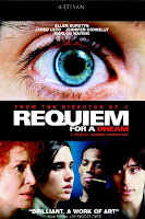
The section with the rapid editing was intended to show the Christian’s loss of sanity, as he looks in the mirror contemplating. For this section I was inspired by the film Requiem For a Dream (2000, Darren Aronofsky), which uses rapid editing of close-ups with pleonastic sound to highlight the different character’s addictions.

Here, I used a similar technique to show the turmoil going on inside Christian’s head, until he finally screams out. Whether these scenes are ‘real’ or not could be interpreted both ways by the viewer. It could be interpreted to be his vision of hell inside his head, in which he is running away from his bleak reality; or it could be a real traumatic scene which he is recalling.

Initially, I was going to use fades to black between the bedroom shot and the bathroom shot, and also for the transition to the psychiatrist sequence, however I felt that simple cuts were more effective, especially after a long fade to black from the previous sequence (into the bedroom sequence) as it gave a sense of waking up from a dream, and gave the whole sequence a more realistic feel while he is in his house.

For the dialogue sequence and the shots where the psychiatrist is walking to the door and knocking, it was simply a case of using continuity editing that we learned last year.

For the section where he is being told to close his eyes, I used long fades of different shots from the same position to create the illusion of seeing double, in order to make it look like he is being drugged. I slowed down the point of view shot to enhance this effect.

The end sequence was simply a case of making sure that the non-diegetic soundtrack matched up with the shots as the fact that Christian was in fact murdered is revealed to the audience.

Once again, with the end credits I didn’t want any animations that looked amateurish, so I used a simple fade, making sure the font is once again the same.

Some shots I decided to discard included the idea of a clock ticking backwards, which although easy to implement, was not very effective when I included it in the film. We also intended to have a long shot of Christian running and disappearing into the fog, however this would have meant waiting for another foggy day after our first day of filming was lost, so we couldn’t include this.

Extra Shooting


On Thursday 6th January we did some last-minute shooting to make sure that our film was as good as it could be, and also to compensate for footage which was corrupted by a school computer. We had to re-shoot all of the scenes in the countryside.

Initially, this was a very depressing prospect. Especially considering that the weather was appalling and it had been raining consistently all day. However, this poor weather did at least look excellent on camera, and allowed us to get some very inspiring shots, in particular of the bleak countryside and rivers and puddles at the side of the road.

Using a checklist, we went around the back roads filming all of the shots we needed. Thanks to our (for once) excellent organisation and the knowledge of exactly what we needed, we got all of this done within a few hours. This was pretty fortunate, as by the end of the day we were all completely soaked, which was deeply unpleasant.

Even though many of the shots from the countryside will only be in the film for a few seconds or less, I am satisfied that they will be extremely effective in showing our protagonist’s loss of sanity.

Script Addition


In addition to the dialogue scene, we also recorded an extract from a radio program to go at the beginning of our film:

“News today, local man Christian Richardson was found dead in his house yesterday after he was reported missing. It is currently thought that he committed suicide and police are not treating the death as suspicious. Now, for the Monday morning weather report. Today we shall be experiencing patchy showers, with heavier rain to follow later in the day. The temperature will be 3 degrees for most of the country, with a cold wind blowing in from the north. Tomorrow, more showers are expected but with sunny intervals and temperatures not rising above 4 degrees.”

It was written specifically to sound like a realistic local radio program, and was also intended to inform the audience without giving away the ending.

Tuesday, 4 January 2011

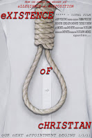
Poster - The Finished Product

Ancillary Task: Poster

Our group had initially decided to each design a different poster and see which we liked best, however when we saw Dave and Taylor's idea of the shirt with the noose, we all decided that we liked it, and to develop that idea instead.

One of the criticisms of the original idea was that it was too plain, especially with a white background. I toyed with the idea of using different colour backgrounds, but it didn't seem to look right. I decided that the best solution would be to have the shirt fill up the whole page in a similar way to the image in the American Beauty poster mentioned in an earlier post. This meant that the noose filled up more of the page and stood out more.

I also decided to make the title font larger, but keeping the original font, keeping the idea of branding of our film consistent. The title is now in dark red, which stands out against the white shirt and also has connotations of danger. This also reflects the shot in the film where blood drops into the sink. The text is also broken up into different parts of the page, which makes the poster more interesting to look at and also gives a sense of disjointedness similar to the use of lowercase letters for the first letter of each word.

Upon asking the group what they thought of my take on the idea, reaction was universally positive with only a few criticisms, namely that there should be some other text on the poster, perhaps with awards, or the names of the cast etc.

Magazine Article - The Finished Product

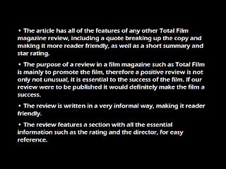
Even though we had settled on a final draft of the magazine review, Dave Huxford and I decided to redraft it one more time. We edited a few sections to make them more readable and then I used photoshop to make it into a realistic looking review from Total Film Magazine:

Ancillary Task: Magazine Article - Final Draft


This is what shall be viewed on the magazine article in the magazine we have chosen to do it in. This version of the ancillary task looked to be the best it could possibly be, thus, I typed it up and sent it to Dave waters to turn it into an official looking magazine article.

This had been seen by everybody in the group, so the creative input of everybody was put into this final draft. Because of this, we were all able to agree on something that we all though was suitable, yet interesting enough for the magazine article. The collective information provided from the 1st and second draft, and the input of the group allowed this task to be as best as it could be.


Ancillary Task: Magazine Article - Second Draft


The second draft, as seen above, has been edited so that it meets the requirements that the 1st draft annotations made clear. The edited parts are seen in the 2nd draft as they are in red.

The idea of the magazine article (in my eyes) was to engage the reader in a conversation, and I feel that the 2nd draft does a better job of this than the 1st draft. However, one problem still lies.

I feel the ending needs a greater summary to it. The idea of the concluding paragraph is to convince the reader through the use of evidence in the earlier parts of the article. So something needs to change about that. Other than that one minor point, the article looks a lot better, and is starting to look how I had originally envisioned it would be like.


Ancillary Task: Magazine Article - First Draft


On top of the film poster, the other ancillary task each media group has been asked to complete is a magazine article about the short each we have created. In can be in any magazine that we desire, but we feel that it would be more appropriately placed if it was in a film magazine (Empire, Total Film etc.). The idea behind this, much like the film poster, is to make this project look as authentic as possible, making it look like this short film will genuinely be realised to the public eyes.

What I have done with the first draft is basically give us something to work with. The idea of this article is that the reader is having a conversation with the writer of this article (coincidentally me), so it needs to contain 3rd person context throughout to keep that conversation style going. This style is a lot better than ordinary analysis style writing because the reader feels more engaged in the text, so they feel more comfortable to read on, and aren’t really bored as they read on.

The magazine so far has been split up into 4 paragraphs. I didn’t want the article taken up to much room as I felt it unrealistic of a magazine article on a short film to take up more than one page. The paragraphs go in order of: Introduction, introducing the audience to the ideas of short films and it’s high regard for this film; Opening the film to the audience, telling them a brief background about the film (like the makers, cast etc.); Characters: the roles in which they play within the film and how effective that is and the conclusion: a realistic overview of what the magazine thinks of the film, including a rating out of 10 and where to find the short film.

The article obviously needs more work on it because it’s only a first draft, but my main concern with it so far to make it less formal, and more of a conversation with the reader. This most likely will include more humorous comments, and less statistics and general points about the film. But so far, I feel a good start has been made and it can only get better from here.

Magazine Review Research: Total Film Magazine


Before writing a magazine review as part of the Ancillary Task for our production, I thought it would be extremely helpful to do some research on the area. Total film is one of the most popular film magazines in the UK, and this is the magazine we will write our review for.

In Total Film Magazine, all of the new releases are reviewed in the “Screen” section. The major films are given the most space, while the less significant films are given less coverage in the magazine. Each film receives a star rating out of 5, although the majority of films receive 3 or 4 star ratings. This is in contrast with magazines such as Sight and Sound, which is scholarly and often gives negative reviews. Magazines such as Total Film and Empire can’t afford to give bad reviews otherwise they would lose money on advertising.

The style of writing often attempts to be humorous, especially when giving a negative review. It is informal and easy to read, appealing to the mass market. The articles are laid out in much the same way as a newspaper, with columns broken up by selected quotes. One unique feature of Total Film is the “predicted interest curve” which informs readers whether the film is interesting all the way through.

The articles also feature a short verdict and a “see this if you liked” section, which serves to both recommend other similar films and to help the reader determine whether that particular film is one which they would like to see.

Most of the big articles have pictures from the film accompanying them, giving the reader a sense of the film’s mise-en-scene. They usually have some sort of humorous caption as well.